Teaching
2021–2025 Lecturer at Kingston School of Art, London
2023–2024 Lecturer at Camberwell College of Arts, London
Workshops
2025 Type and Movement workshop for Movement Research Performance Journal in collaboration with Carlos Romo-Melgar and Moriah Evans, New York
2025 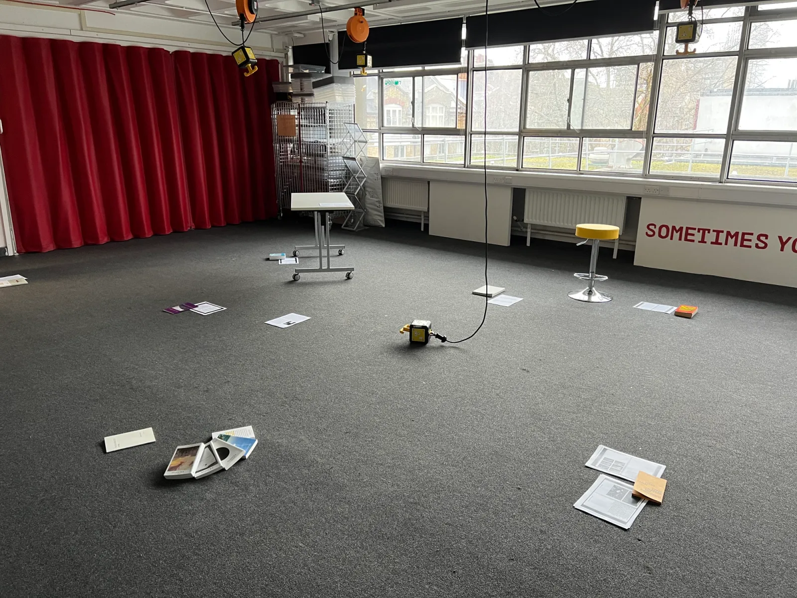 The Body as a Publisher (a Typographic Opera) workshop about Publishing, performance, language and typography, London College of Communication
2024 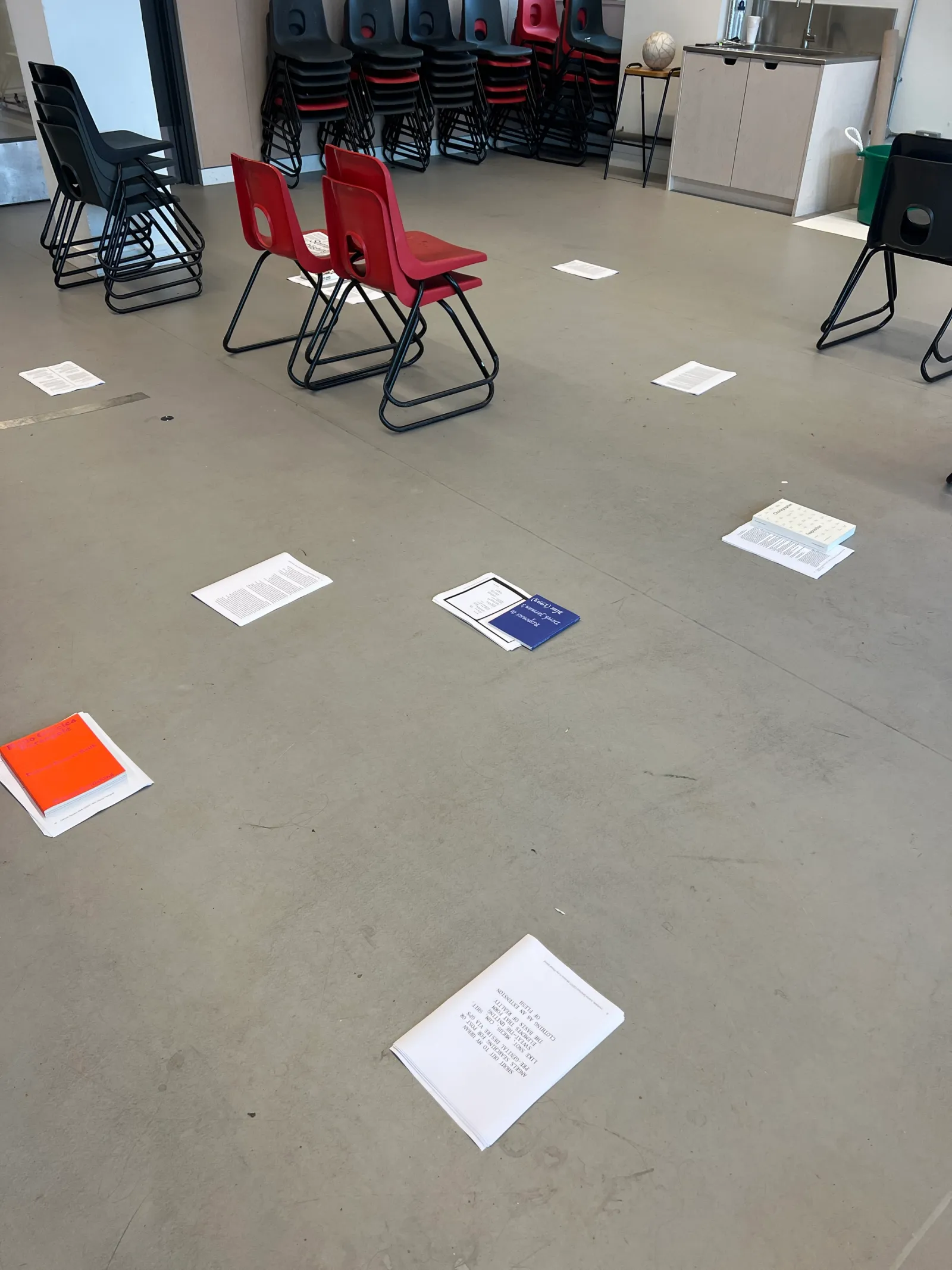 Somatic Publishing workshop about Publishing, performance and language in collaboration with Alessia Arcuri, Kingston University, London
2022–2023 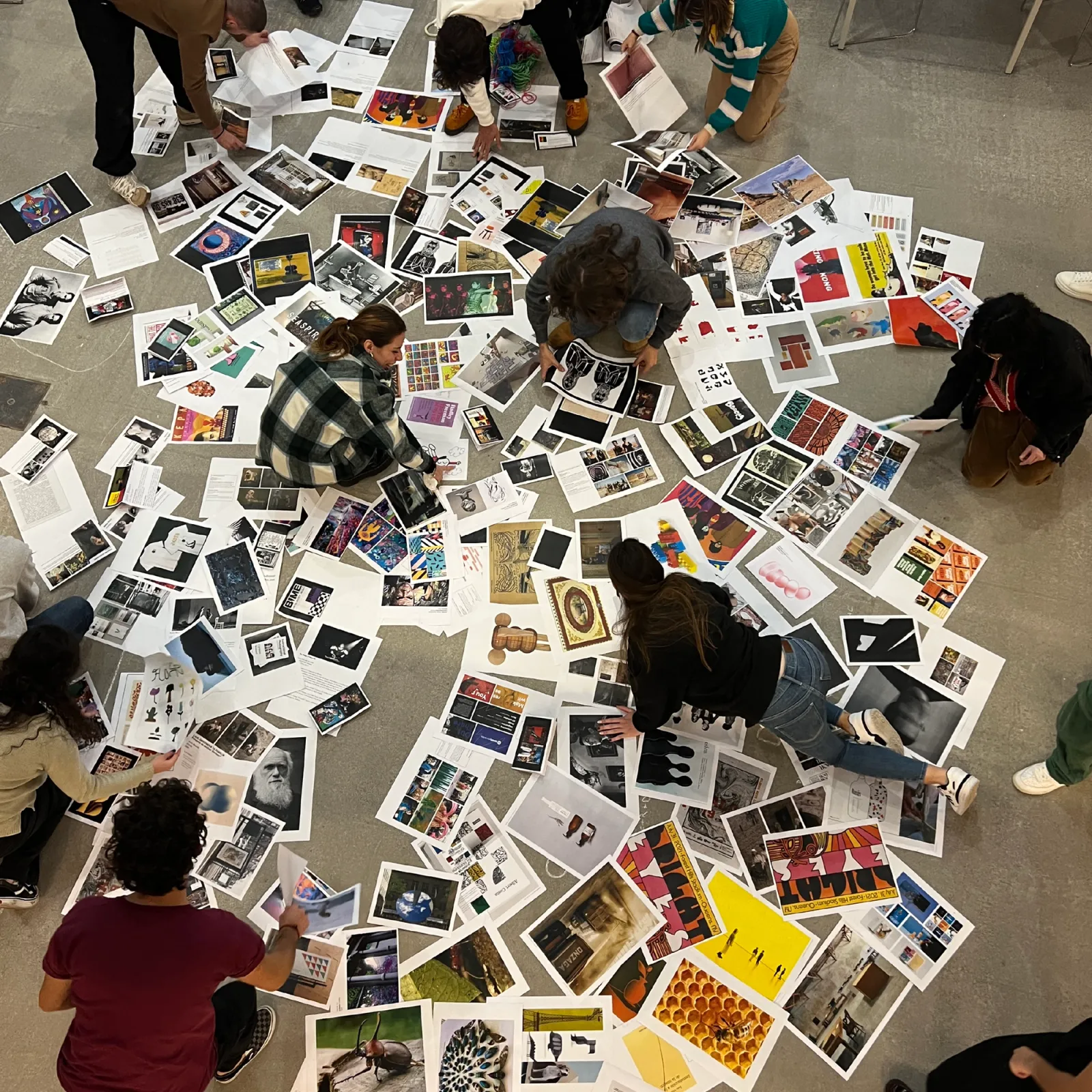 Situated practices and Critical Positions workshop series about Design Research, positionality and non-linear writing in collaboration with Carlos Romo-Melgar, IED Madrid, IED Kunsthal Bilbao and IED Barcelona
2024 DRAMA Erotica workshop in collaboration with Alessia Arcuri and Giulia Astesani, Chisenhale Dancer Centre, London
2023 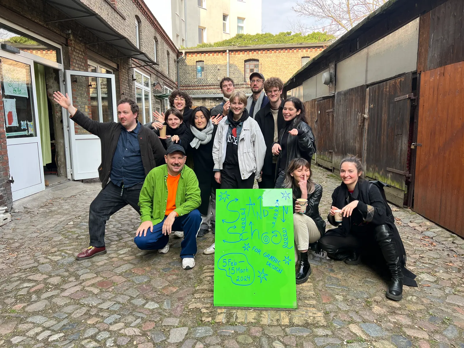 DRAMA as part of the Stand-in School for Graphic Design, in collaboration with Alessia Arcuri, Berlin
2023 DRAMA on Listening workshop in collaboration with Alessia Arcuri, Kingston School of Art, London
2023 DRAMA on Sobremesa workshop in collaboration with Alessia Arcuri, Carmen Gray and Maria de la O Garrido, Apiary Studios, London
2023 DRAMA on Sound workshop in collaboration with Alessia Arcuri and Eevee Zayas-Garín, Apiary Studios
2022 DRAMA on Carnality workshop in collaboration with Alessia Arcuri
2022 DRAMA on Oversharing in collaboration with Alessia Arcuri as part of the Summer Event
2012 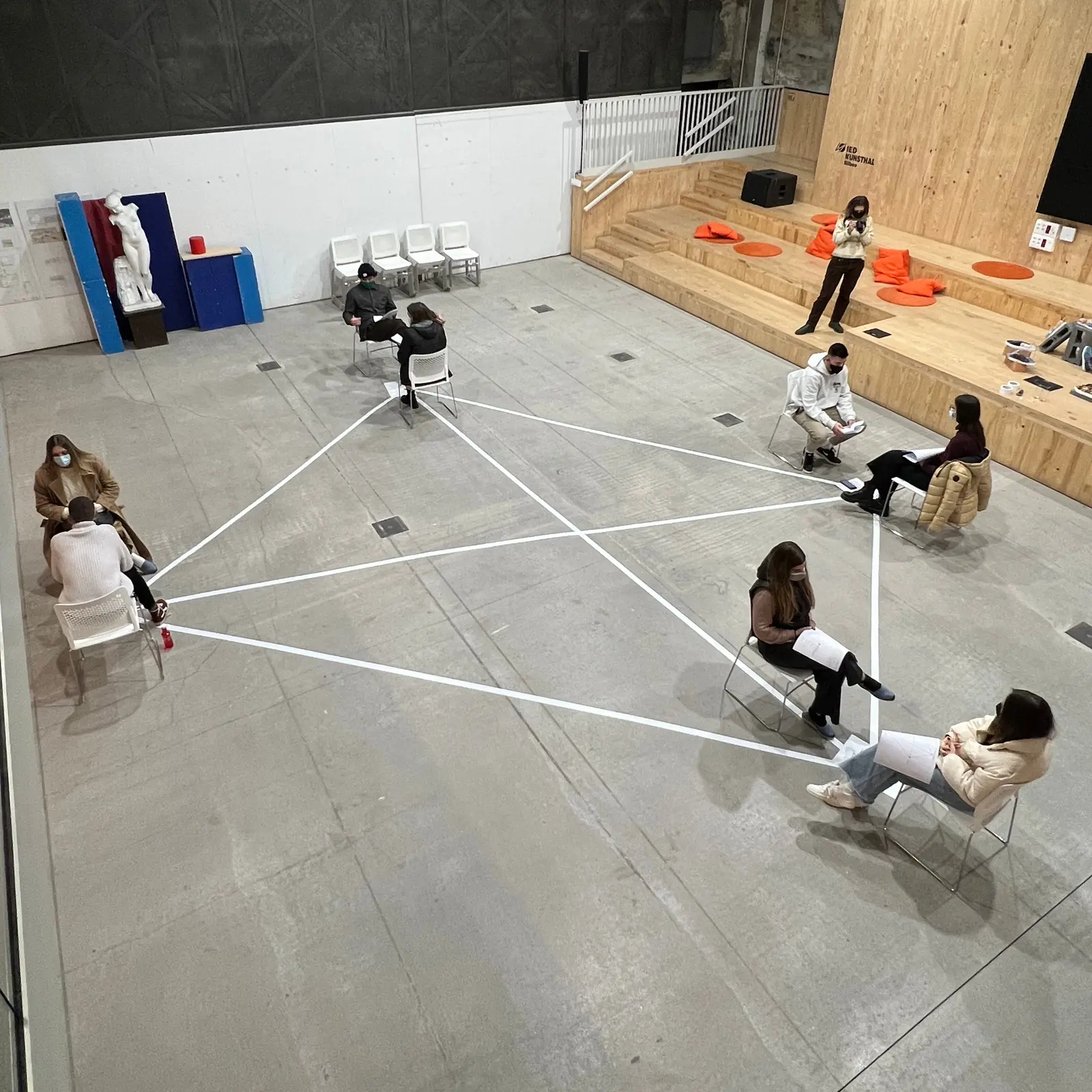 Research Through Design workshop about Design Research, IED Kunsthal Bilbao, Spain
2012 Parasocial Relationships workshop about fandom and merch, London College of Communication
2019 STORE Warsaw Summer School about performative furniture In collaboration with Ujazdowski Castle Centre for Contemporary Art
2019 Sound Symbolism East Education Summer School, Here East, London
2018 Tools for Print Printmaking and 3D workshop, as part of STORE Projects, Woodbridge School
2018 Inflatable Structures VR and inflatable structures workshop, as part of STORE Projects, Open House London, University College London
2018 Queer Flags Graphic design and activism workshop, in collaboration with The Outside Project and Queerseum for London pride and Science Museum’s Late event on Sexuality
2018 Flatland Casting Workshop, as part of STORE Projects, Pimlico Academy
Lectures
2025 Somatic (Acts of) Publishing, Shared (Practices of) Cooperation, Rutgers University
2025 Around Cooperation part 2, Pratt Institute, Brooklyn
2025 Around Cooperation, London College of Communication. University of the Arts London
2025 Typographic Gestures, Type&Faces, London
2023 Exchanges Between Graphic Design and Performance, Pratt Institute, Brooklyn
2021 Narrative Environments, IED Kunsthal Bilbao, Spain
2018 Diagrammatic Drawing, The Architectural Association, London
2018 Queer Objects, Universidad Católica de Chile, Santiago
2017 Neurodiversity and Design, London College of Communication
Guest Critic
2025 Parsons School of Design
2025 Pratt Institute, New York
2025 Columbia University, New York
2023 Pratt Institute, New York
Facilitating
2022 Curator and Supervisor at United Practice’s Summer Event in collaboration with Carlos Romo-Melgar, Open Practice and V-RM Studio
2022 Design Advisor for ‘A Line Which Forms a Volume 6’ in collaboration with Carlos Romo-Melgar and Bryony Quinn. Design Supervision and coordination of the student-led publication at MA Graphic Media Design, London College of Communication
2021 Curator and Supervisor at United Practice’s Summer Event in collaboration with Carlos Romo-Melgar, Open Practice and V-RM Studio
Residencies
2022 Bidston Observatory Artistic Research Centre, Liverpool, UK
2019  Fabra i Coats in collaboration with Manuel Cruzcastillo and Carmen Seijas, Barcelona, Spain
2018  Balmaceda Arte Joven in collaboration with Manuel Cruzcastillo and Carmen Seijas, Santiago de Chile, Chile
2018 Queering Mozfest in collaboration with Stéphanie Ouillon, London, UK
Press
2025 It's Nice That, article by Ellis Tree
2025 The Brand Identity, article by Poppy Thaxter
2022 Creative Boom, article by Dom Carter
2021 Eye Magazine
2020 It’s Nice That, article by Alif Ibrahim
2019 AIGA Eye on Design, article by Emily Gosling
2019 It’s Nice That, article by Lucy Bourton
2018 Joia Magazine, article by Adriana Conde
2016 Metal Magazine, article by Jasmina Avellanedas
2014 Metal Magazine, article by Gabriel Bravo
Published writing
2024 Design Notes for MRPJ #60 written by Carlos Romo-Melgar and John Philip Sage, Movement Research Performance Journal - issue 60: Gender Disarray
2023 Design Notes for Eaten by the Internet written by Carlos Romo-Melgar and John Philip Sage, Eaten by the Internet, Meatspace Press
2023 Towards a Reparation of a Depleted Network written by Carlos Romo-Melgar and John Philip Sage, A Line which Forms a Volume 6
2021 Design Notes: AI Constrained Design written by Carlos Romo-Melgar, John Philip Sage and Roxy Zeiher
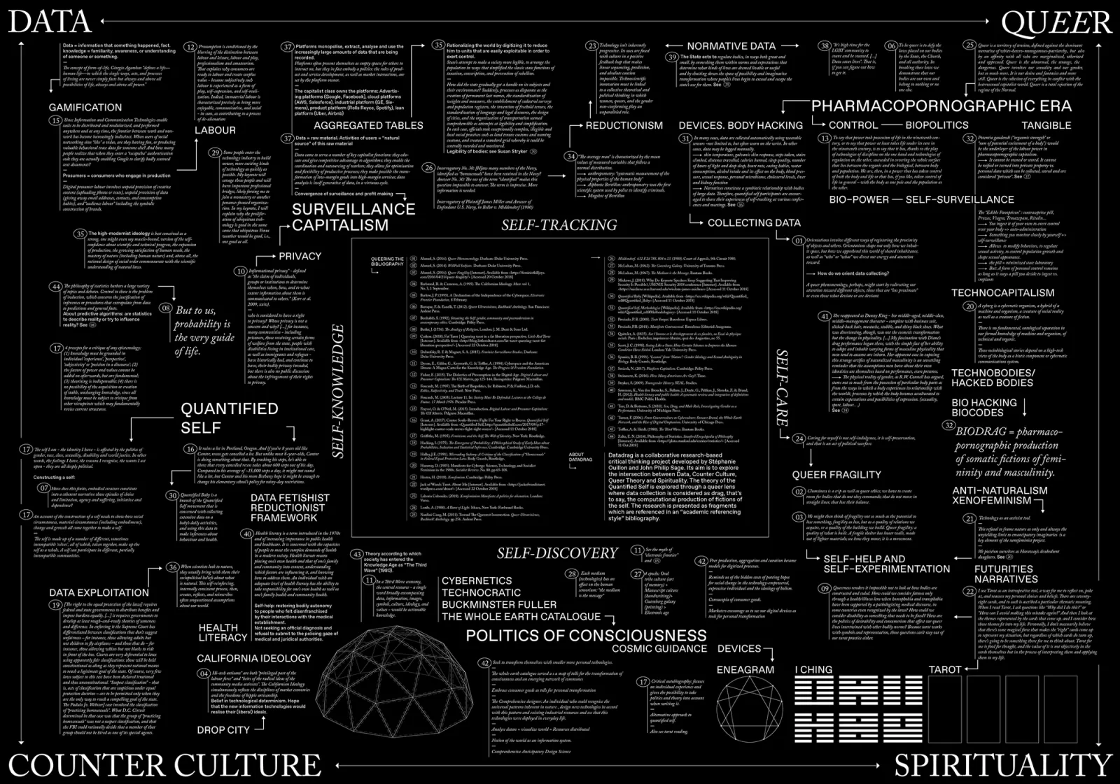
2020 Design Notes for Data Justice written by Carlos Romo-Melgar and John Philip Sage
2018 Temporary techno-social gatherings? A (hacked) discussion about open practices written by Kat Braybrooke, Luca M. Damiani and John Philip Sage
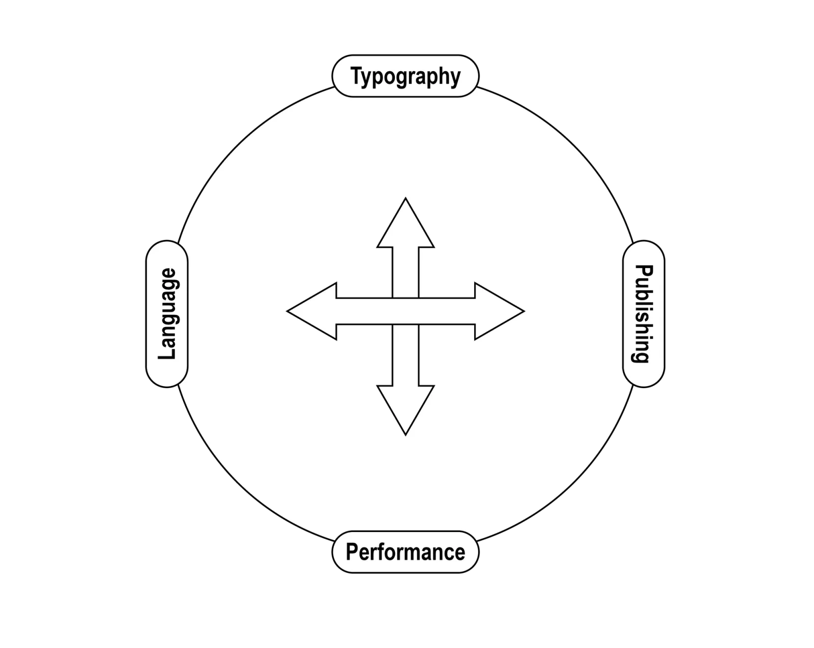
john philip sage (he/they) is an artist, designer, researcher, and educator that operates in hybrid modes of cooperation. Their research looks at the relationship between publishing, performance, typography, and language, often through  publications,
 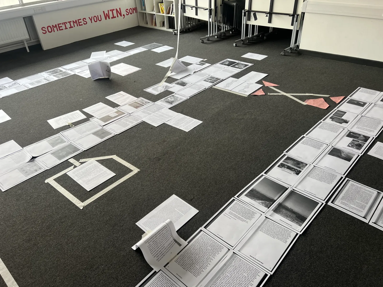 workshop methodologies,
 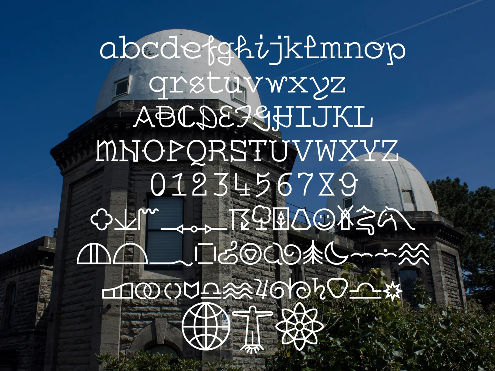 type design and
 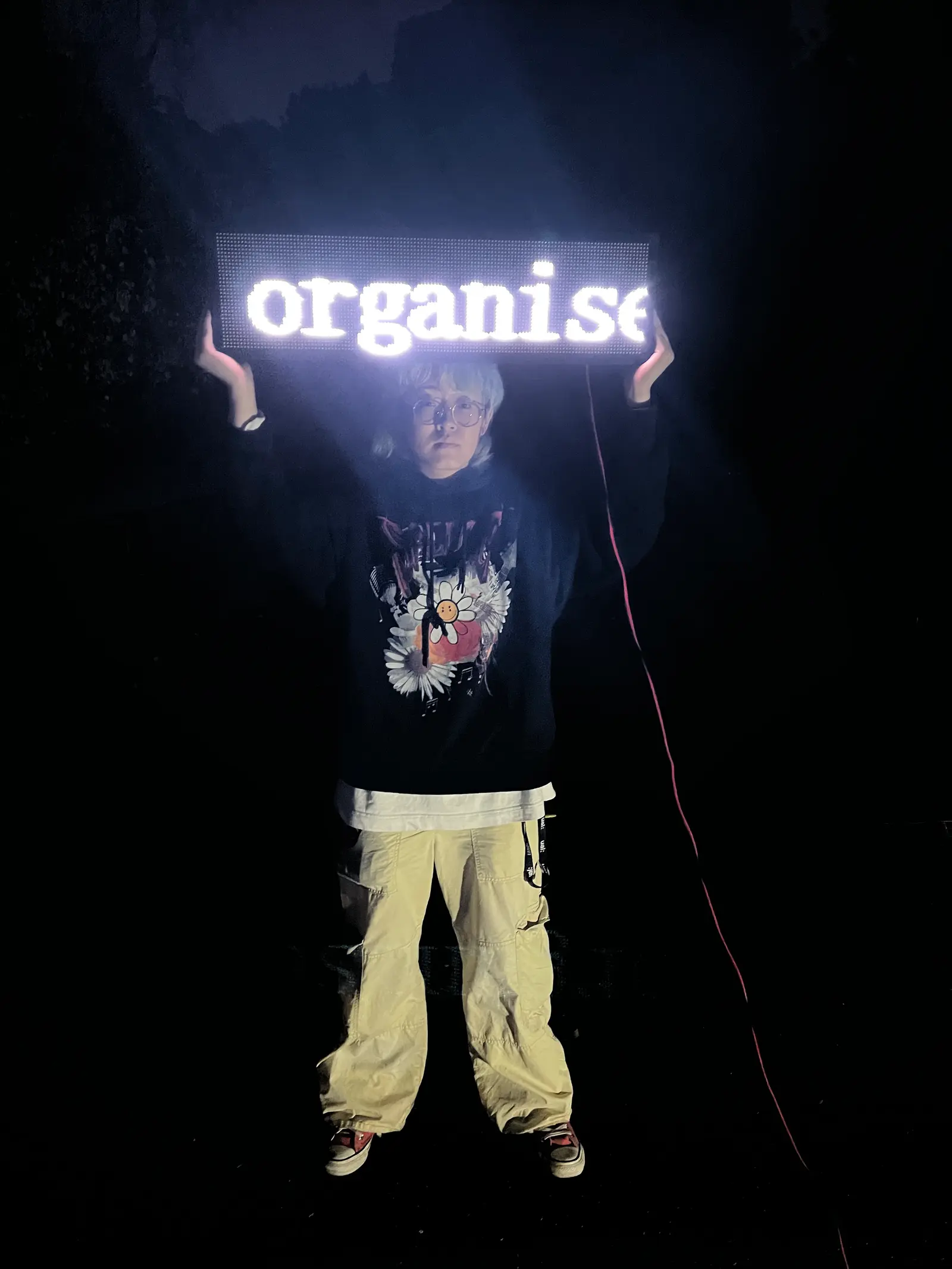 spatial interventions. Their research continues to expand on the notions of [somatic*] publishing and performance as modes of activating, sharing, and distributing content with other bodies. As designers, we work with raw content and every design [gestures] is an act of re-interpretation. John is interested in disseminating the interpretative strategies we use as designers, how language gets materialised through typography and the material effect that language has on bodies. Grounded in a commitment to critical forms of design dissemination, their approach embraces collective, distributed, and situated forms of knowledge production. They have been a lecturer at Kingston University and Camberwell College of Arts, and they are currently an associate member at STORE Projects. They have also participated in art residencies at Fabra i Coats (Barcelona) and Balmaceda Arte Joven (Santiago de Chile).
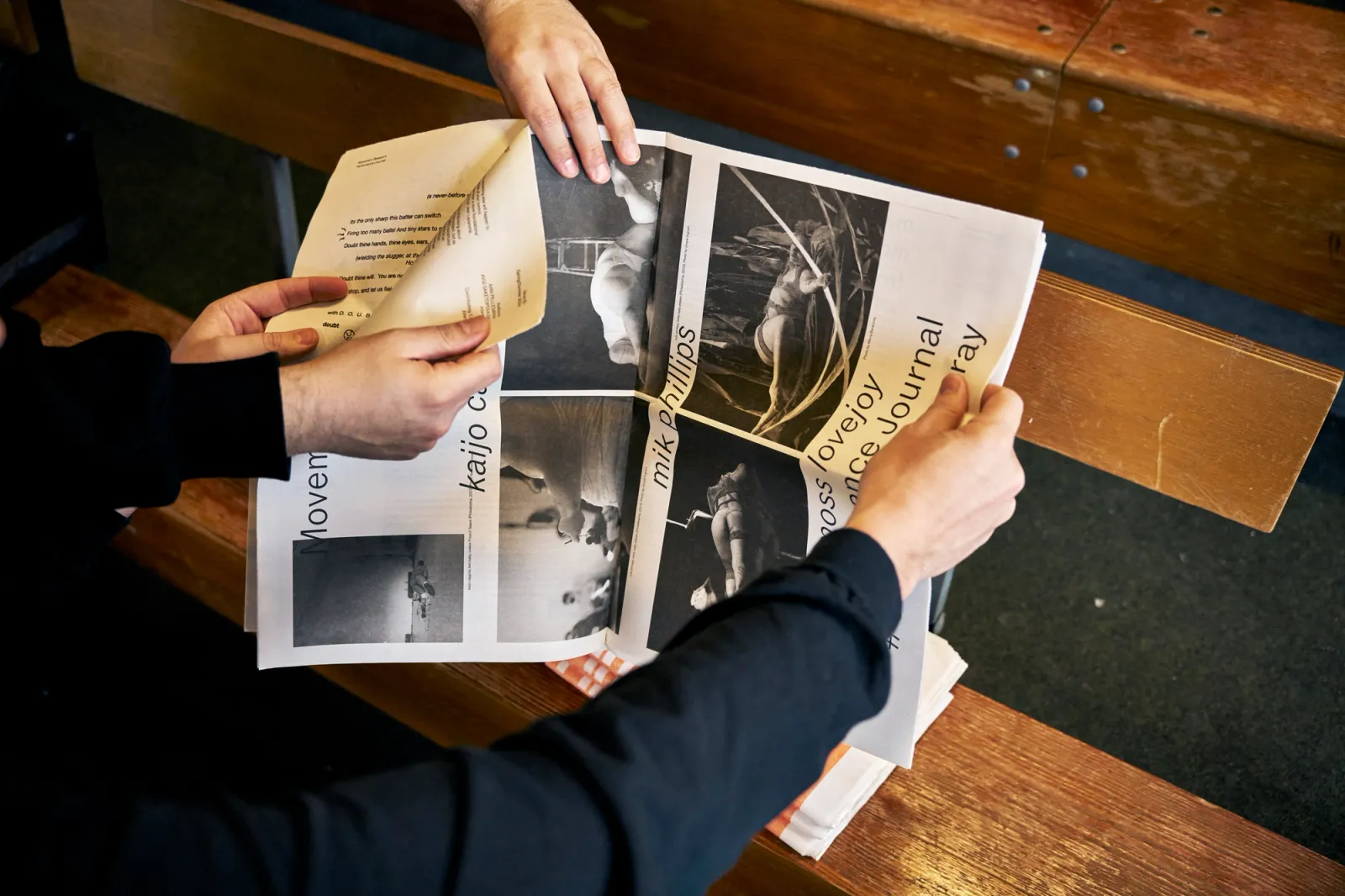
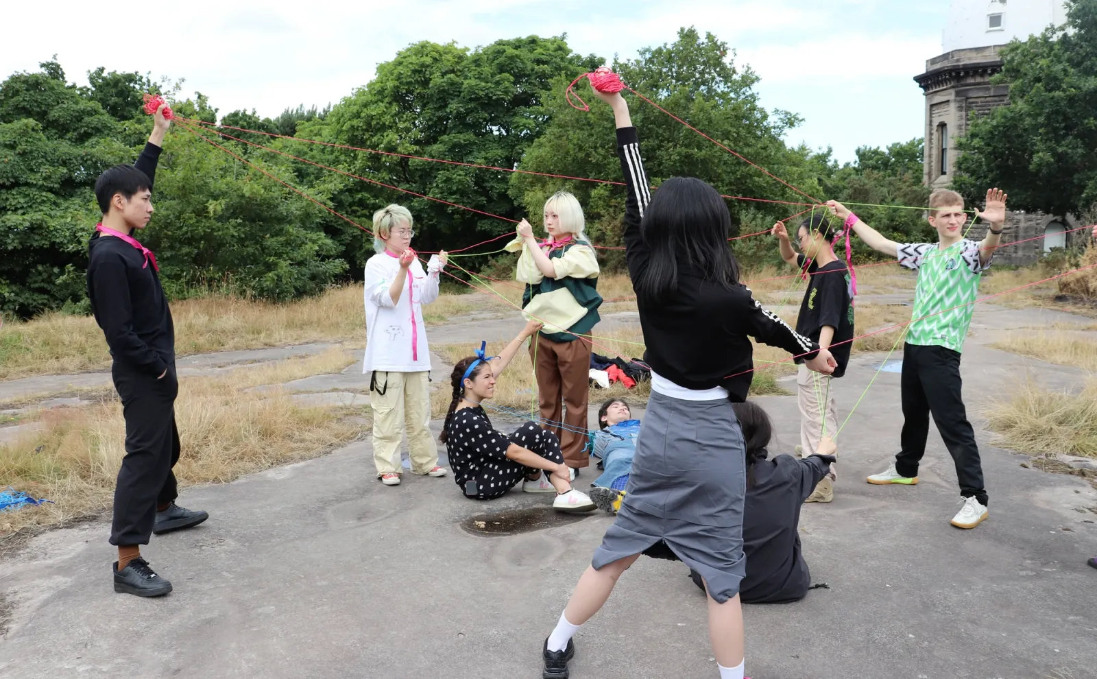
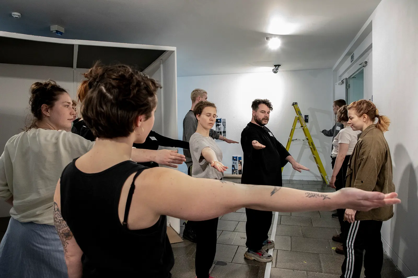
What does it mean to choreograph a reading? Approaching the Movement Research Performance Journal as a space for rehearsal, Carlos Romo-Melgar and I proposed a redesign that treats reading itself as a choreographic experience. Paratexts [titles, footnotes, images, margins, page numbers, citations, etc] become devices that guide the reader through temporal and spatial sequences, shaping how meaning emerges. Each issue activates paratext differently, responding to its theme, so that reading is never fixed but always relational and improvisational.
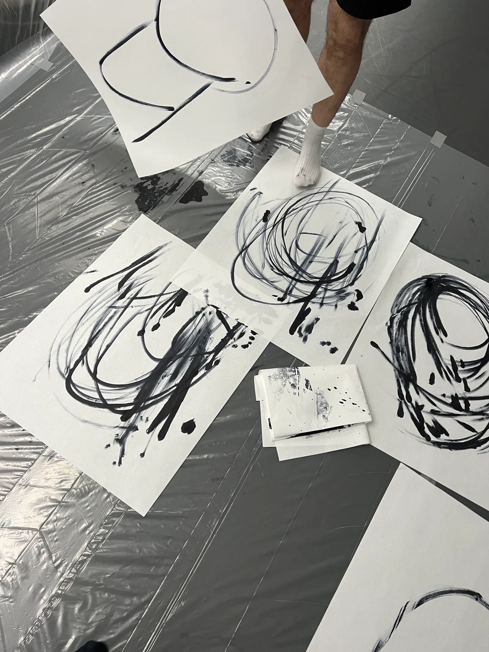
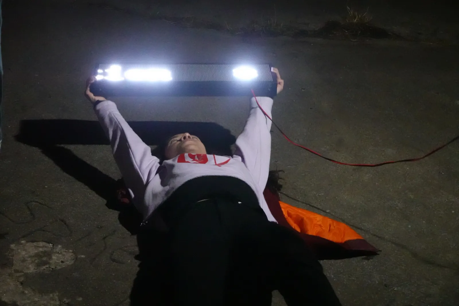
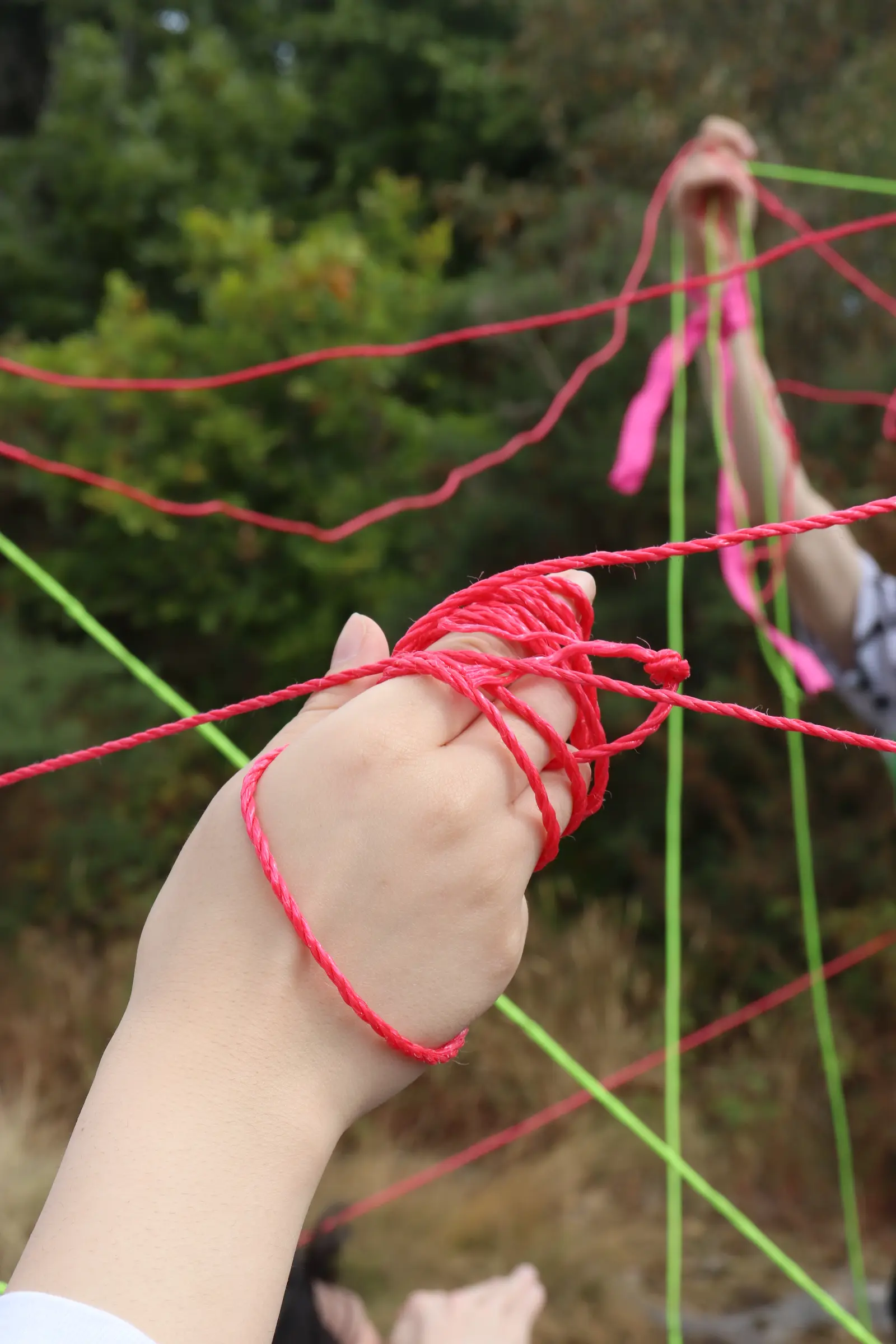
In this workshop, developed with Carlos Romo-Melgar for the Movement Research Performance Journal, we explore intersections between movement and letterforms. We invited participants, many outside graphic design, to challenge typographic traditions by engaging with tools, gestures, and bodies rather than fixed rules. Typography often foregrounds the mark on paper while omitting the body that produces it. We propose a shift: using Laban Efforts as a framework to connect bodily movement with typographic gesture. Through shared prompts, participants generate traces, strokes, and graphic components that can later be analyzed for synchronicities and translated into type design.
DRAMA on sound, developed by Alessia Arcuri and Eevee Zayas, Apiary Studios, 2023.
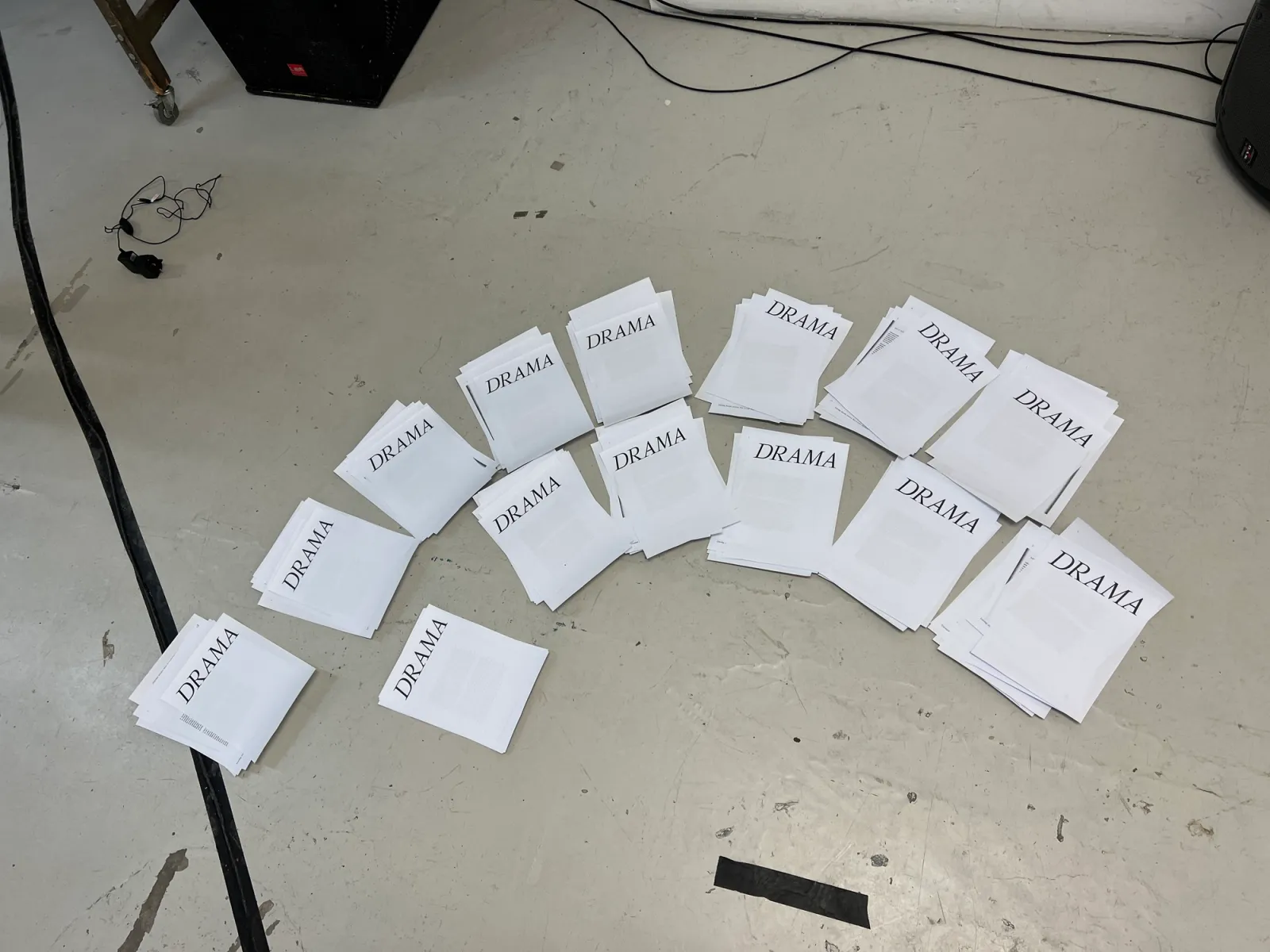
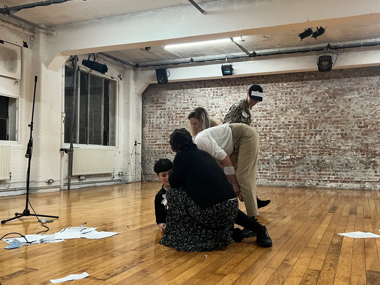
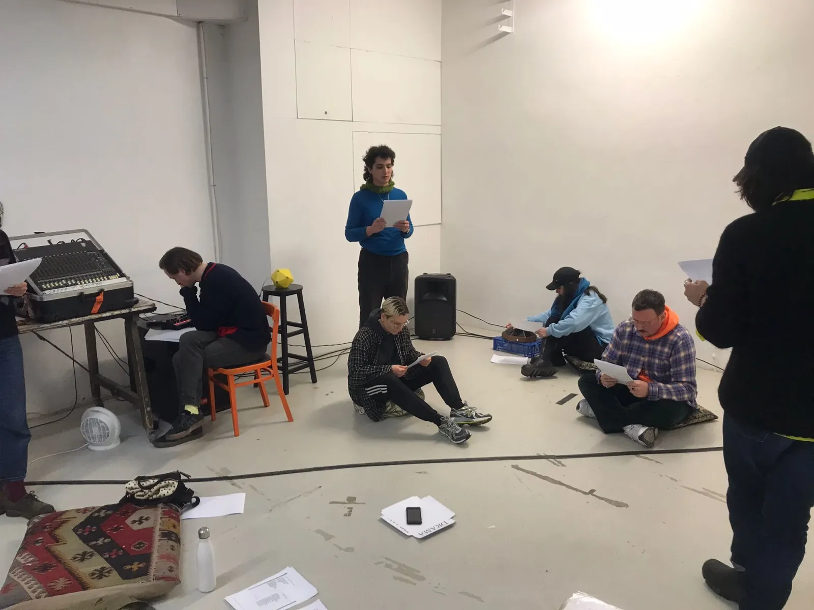
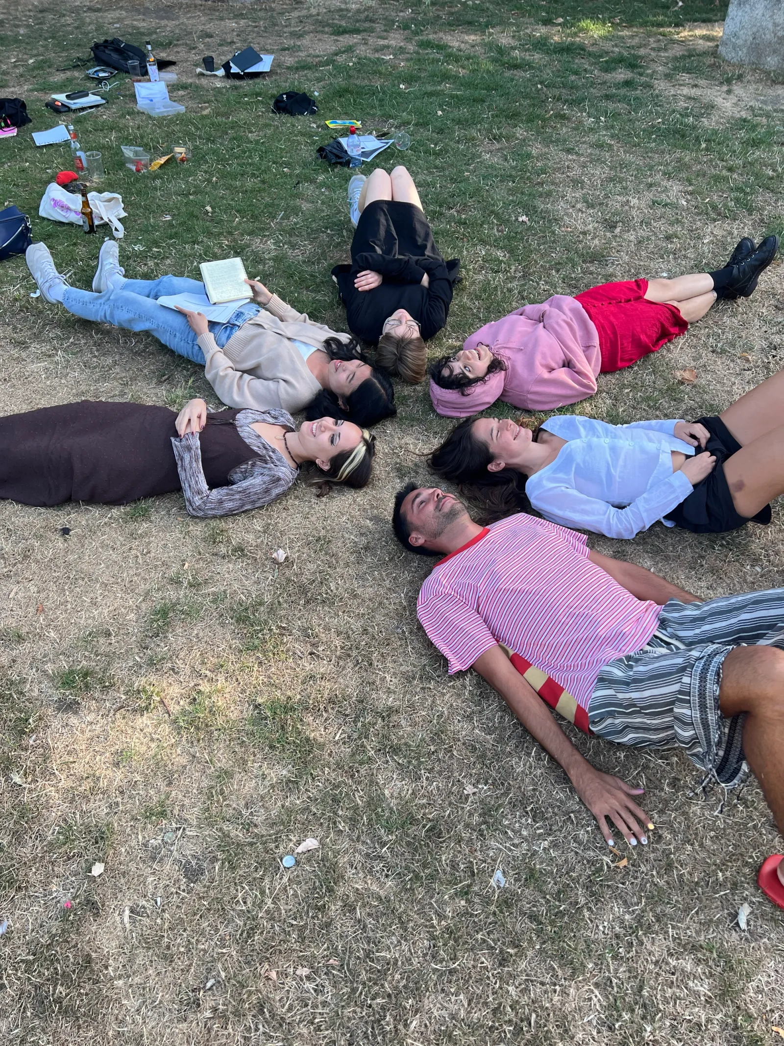
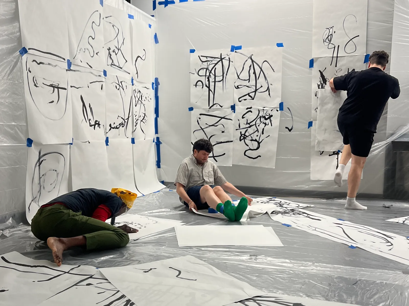
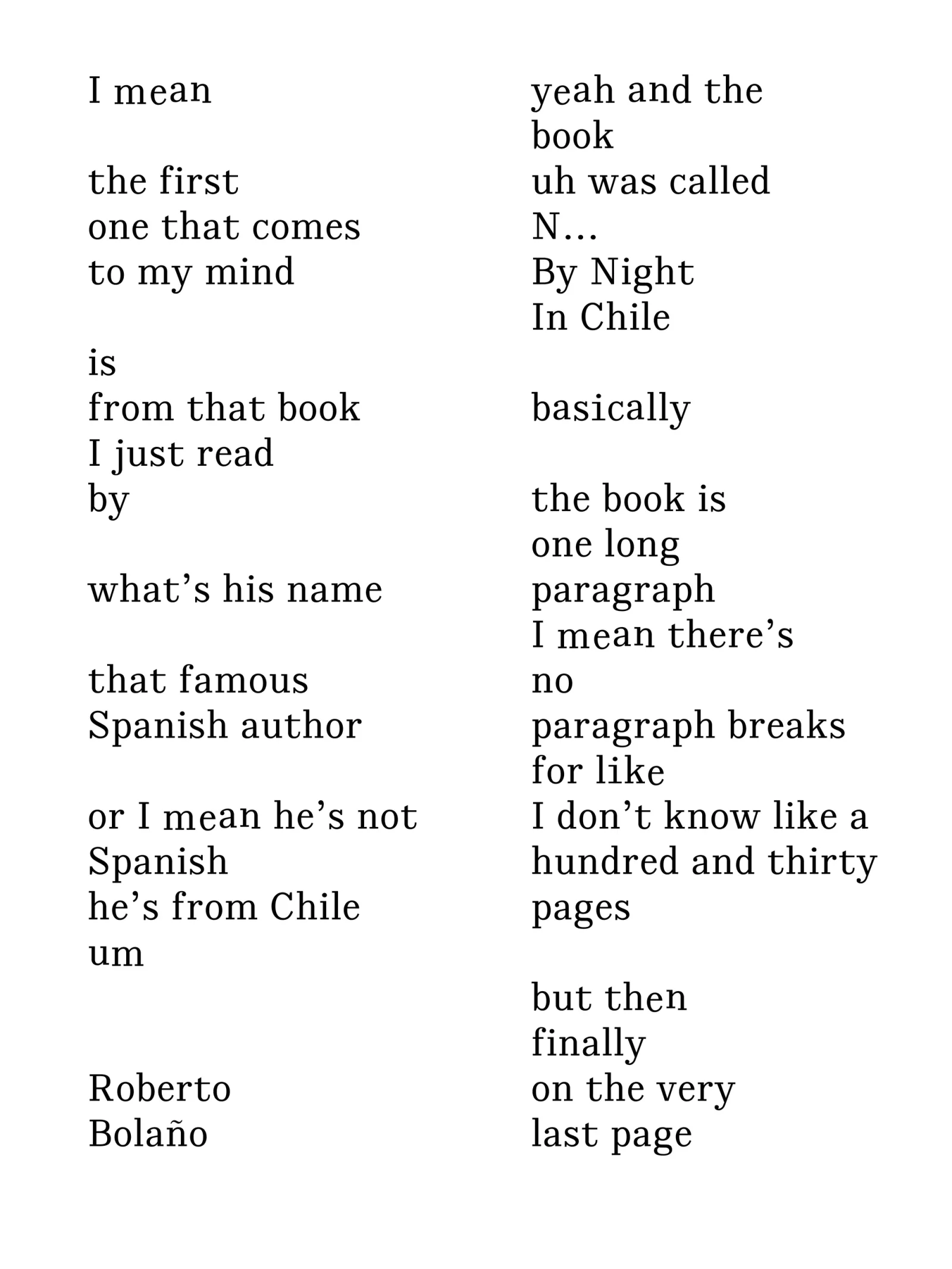
DRAMA, developed in collaboration with Alessia Arcurti from 2021 to 2024, is a workshop methodology exploring how text can be activated and its reception affected, through voice, sound, movement, space, and collectivity. It investigates non-linear, personal, and performative approaches to the production and analysis of text. Central to DRAMA is the notion of ‘over-sharing’ as a tool for empathy, connection, and affirmation. This concept has intersected with domesticity, carnality, conviviality, sobremesa, listening practices, voice and sound, cybernetics, and lesbian erotica. These seassion have taken place at Apiary Studios, Chisenhale Dance Space, Kingston University, and the Estonian Academy of Arts, and some of them have been designing in collaboration with Eevee Zayas, Maria de la O Garrido, Carmen Gray and Giulia Astesani.

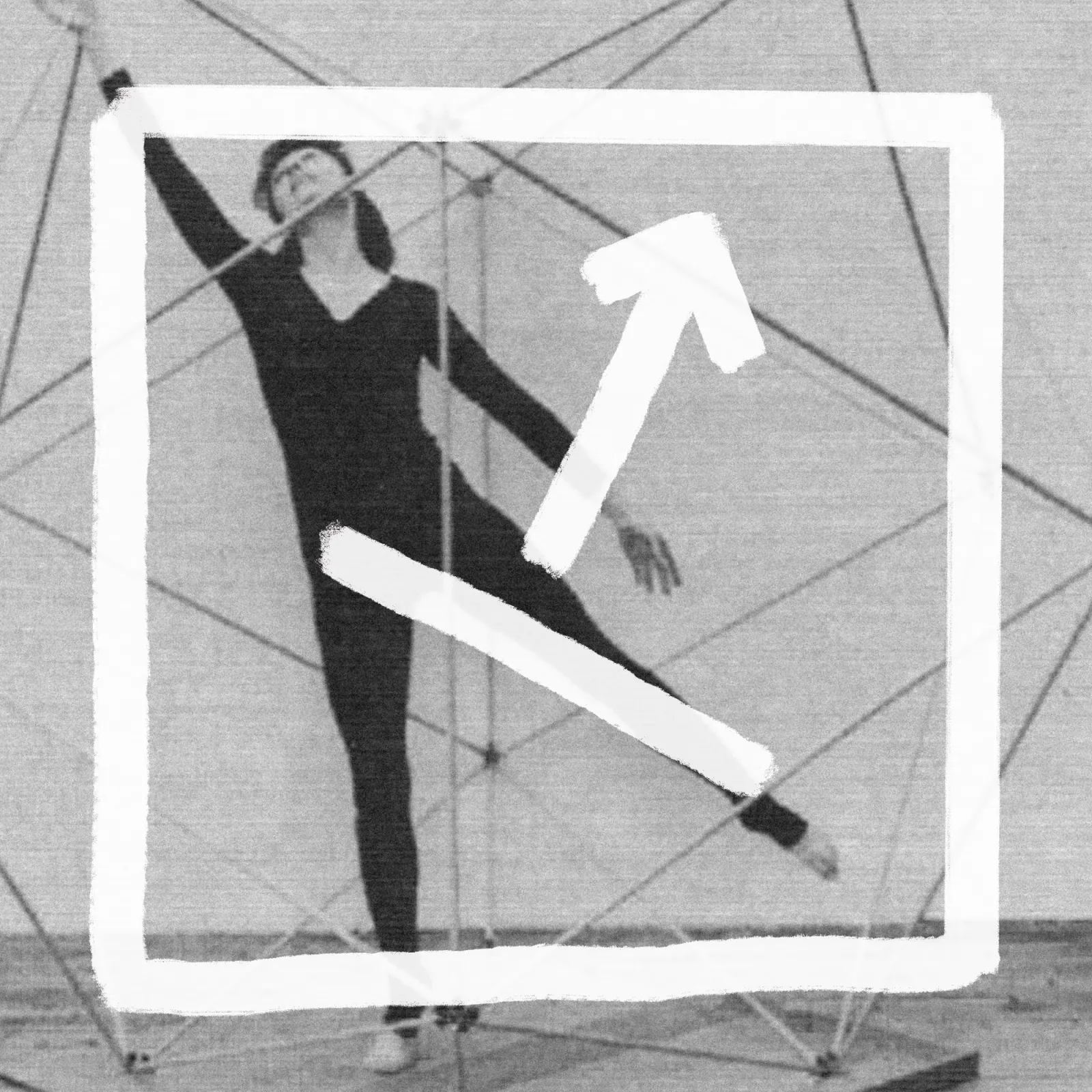
Taking Daniel Linehan’s untitled duet performance as a starting point, “um” is a medium-contrast narrow serif typeface that, despite drawing inspiration from movement, is designed in a subtly controlled manner. The abrupt unbracketed slab serifs position the typeface within the visual realm of numerical and non-gestural, even cybernetic, dance notations such as Labanotation and Beauchamp-Feuillet baroque dance notation. This makes the typeface appropriate for essay-like running text with a research-based, academic tone.
However, the systematic rhythm is disrupted by a series of OpenType features that allow the typeface to behave in more expressive, disruptive, and hesitant ways. These features evoke the strange rhythms of Daniel Linehan’s performance, making its alternate letters great for display and more playful purposes.
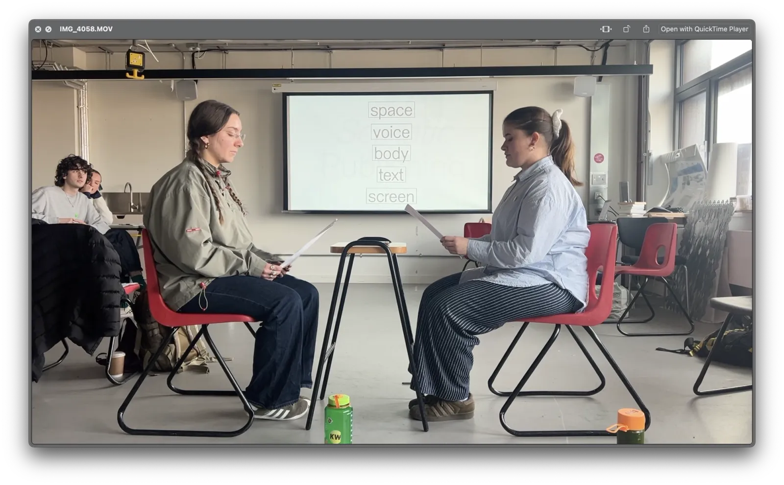
*Somatic Publishing (2023) at Kingston School of Art, developed with Alessia Arcuri, is a five-week module focusing on the relationship between interpretative strategies, performance, and performativity, as well as publishing and embodied forms of knowledge production and dissemination. The act of design supports interpretation: design not only relates to the material form of an object, it also interacts with language by proposing forms of interpretation whose effects are both material and immaterial. Participants explore how publishing can make things public as a mode of interpreting, distributing, and sharing content across bodies and spaces, investigating textual, visual, and multimedia sources to challenge their role as designers.
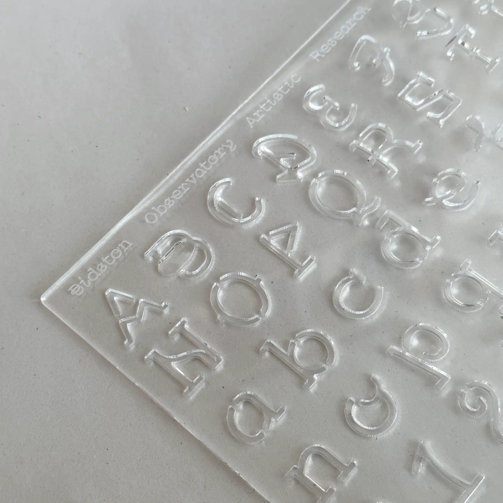
BOARC Courier, desogned in collab with Carlos Romo-Melgar, is an open typeface that translates the ‘imprints’ found at BOARC and Bidston Hill into letterforms. Like other elements of the visual identity, it functions as an open protocol, allowing users to activate, re-evaluate and expand it as they see fit.
The initial version of the typeface sources its forms in archival documents, correspondence, letterheads, carvings on the hill’s surface, and a collection of symbols representative of Bidston Hill. The design of the letterforms is unified by a geometric structure that reflects the visual language prevalent in the archive’s data records, taking advantage of the legal status of Courier and its widespread availability across various devices.
Additionally, the typographic protocol includes a grid that enables users to contribute new glyphs to expand the typeface, encouraging change and distributing authority in the current visual language of BOARC.
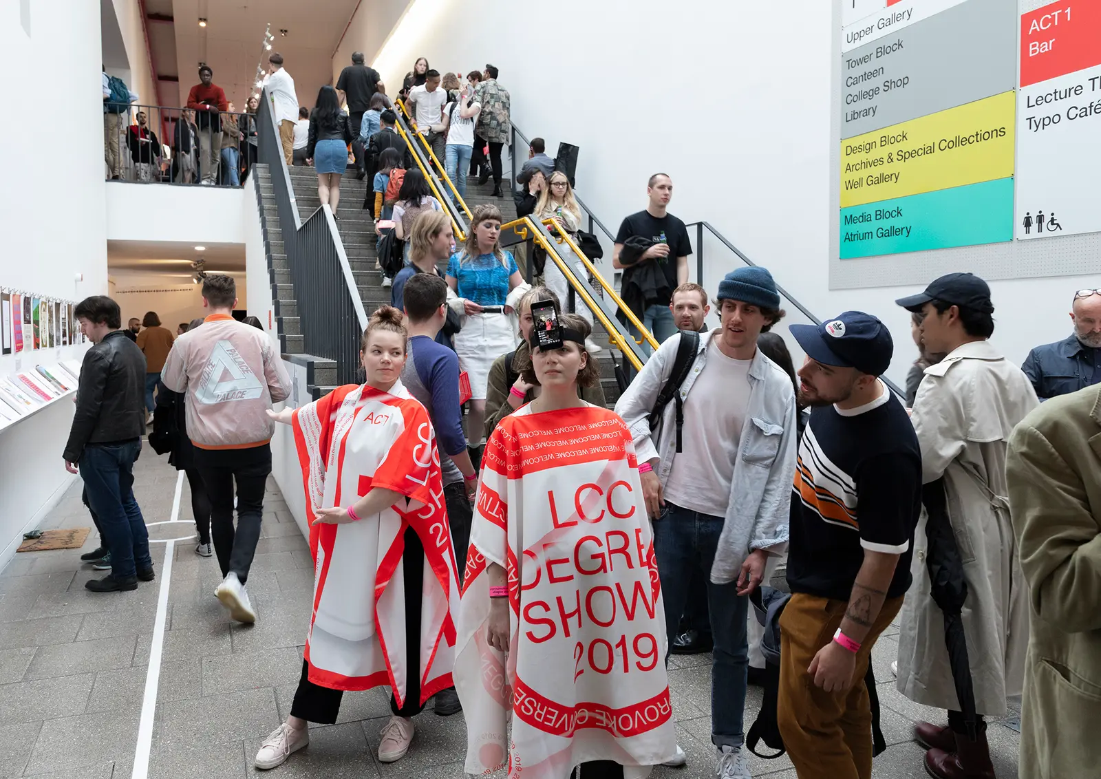
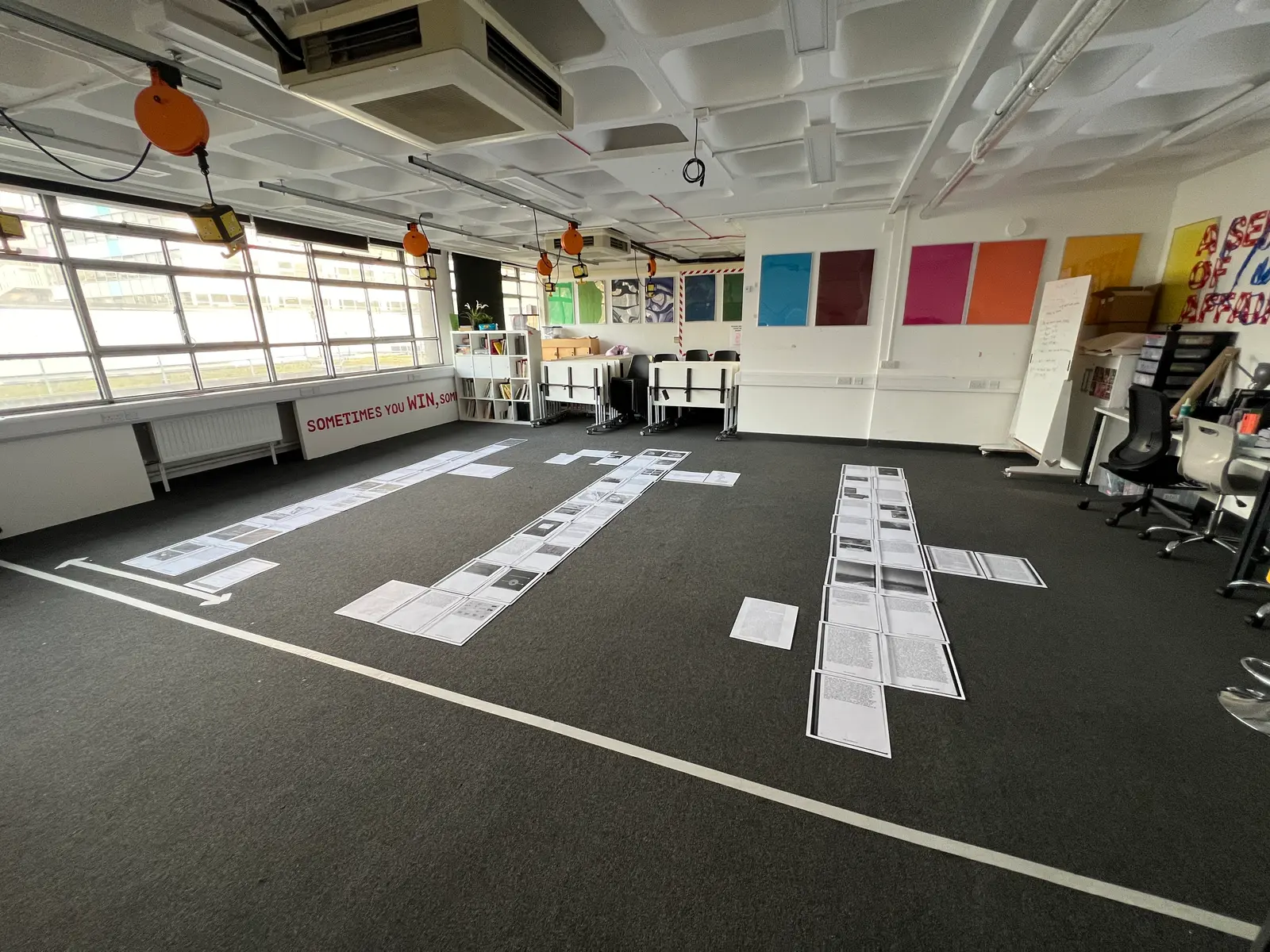
The design of the 2019 degree shows focused in creating a supporting visual system helping to navigate a spatially complex and visually saturated venue such as the London College of Communication. The show proposes a journey through the college building divided into six acts. The different acts are interconnected with each other and don’t overlap with the existing signage of the building. In order to guide visitors throughout the venue, we used a wayfinding system that mainly took place on the floors. This system, is activated by a group of performers during the opening night, delivering practical information and provocative questions to the audience in their interactions. This way, the opening night becomes a choreographed event in which the different actors (the work, the public, the performers, the institution), interact and expand the experience of a degree show, which was live-streamed to social media platforms. Designed with Carlos Romo-Melgar.
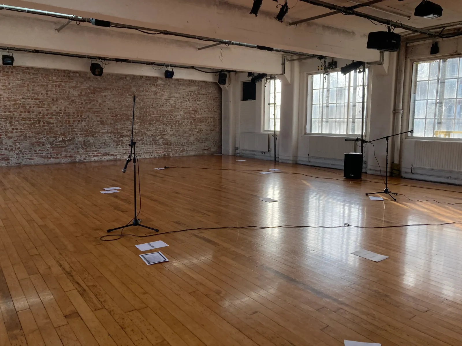
From the walls onto the printed page: the body as a publisher (A typographic opera) is a workshop that explores the relationship between publishing, performance, language and typography. It investigates methods of text activation (including silent, polyphonic, abrupt and disrupted reading), choreographic writing (through gestures, actions and orientation), the materials of reading (such as paper, screens, props and walls) and the bodies that engage in it (their positions and conditions).
The project begins with a single text and gradually expands into other textual and visual sources, with a focus on intertextuality and the transmission of meaning across media.
Recognising the political dimension of publishing as a means of amplifying or marginalising voices, the project pays close attention to queer voices and their role in the production of knowledge. Participants collectively compile, edit and typeset a final outcome presented as a (typographic) opera, which is then activated through a final performance event.
The design notes are something we have developed at spreeeng (where our cooperative model values distributed authorship, shared credit, and equal pay, and avoids hierarchical structures such as the figure of employer or employee). A central value of spreeeng is the dissemination of knowledge generated through design. Design notes are negotiated spaces within projects where key decisions, methods, and research are made public. They function as a way to share the reasoning behind design choices, document experiments and processes, and make insights accessible, extending the impact of our work beyond individual projects and supporting collective learning.
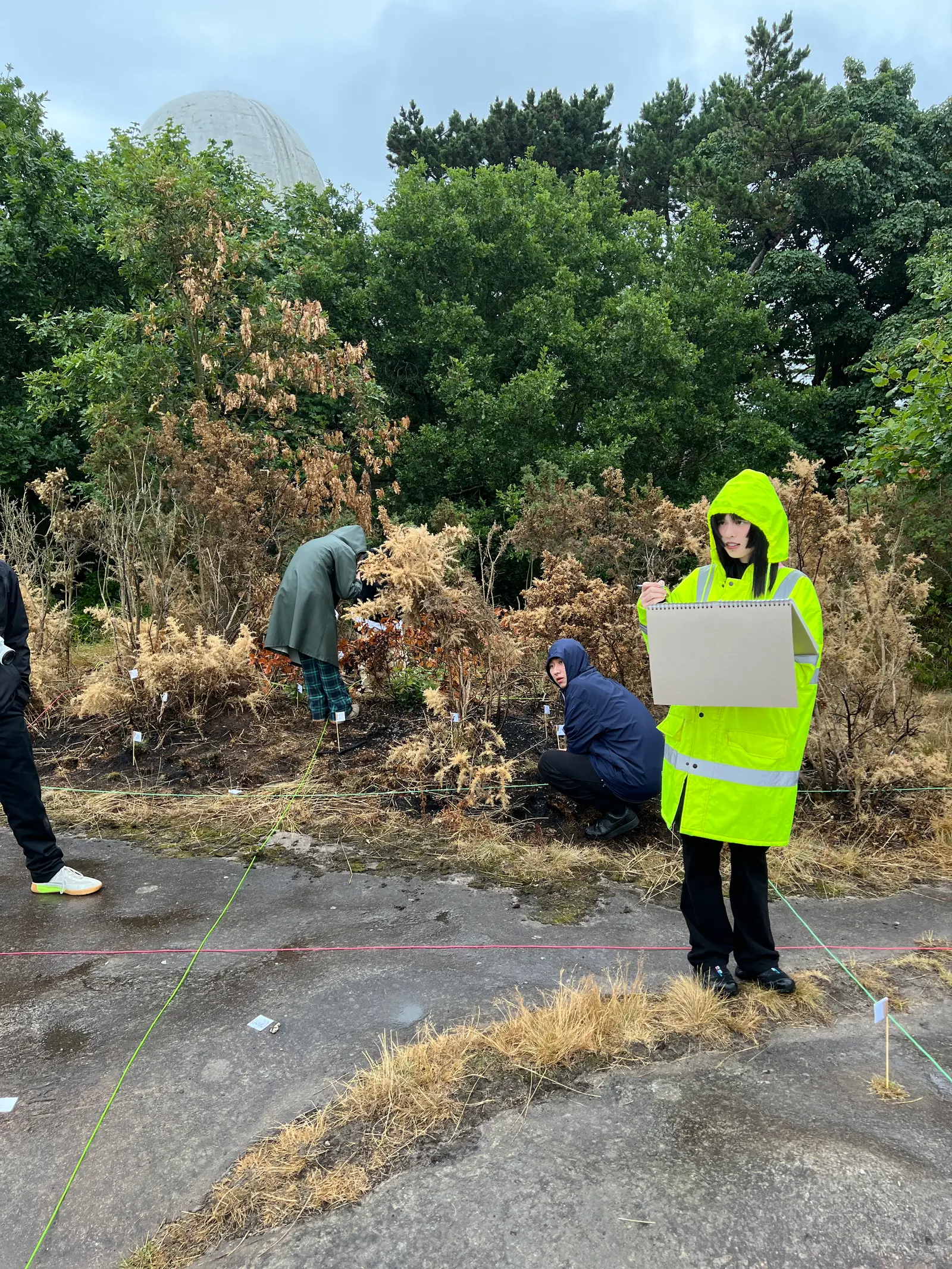
As part of our advisory role for A Line Which Forms a Volume 6, Carlos Romo-Melgar and I led workshops during a residency at Bidston Observatory Artistic Research Centre, exploring experimental editorial and design practices.
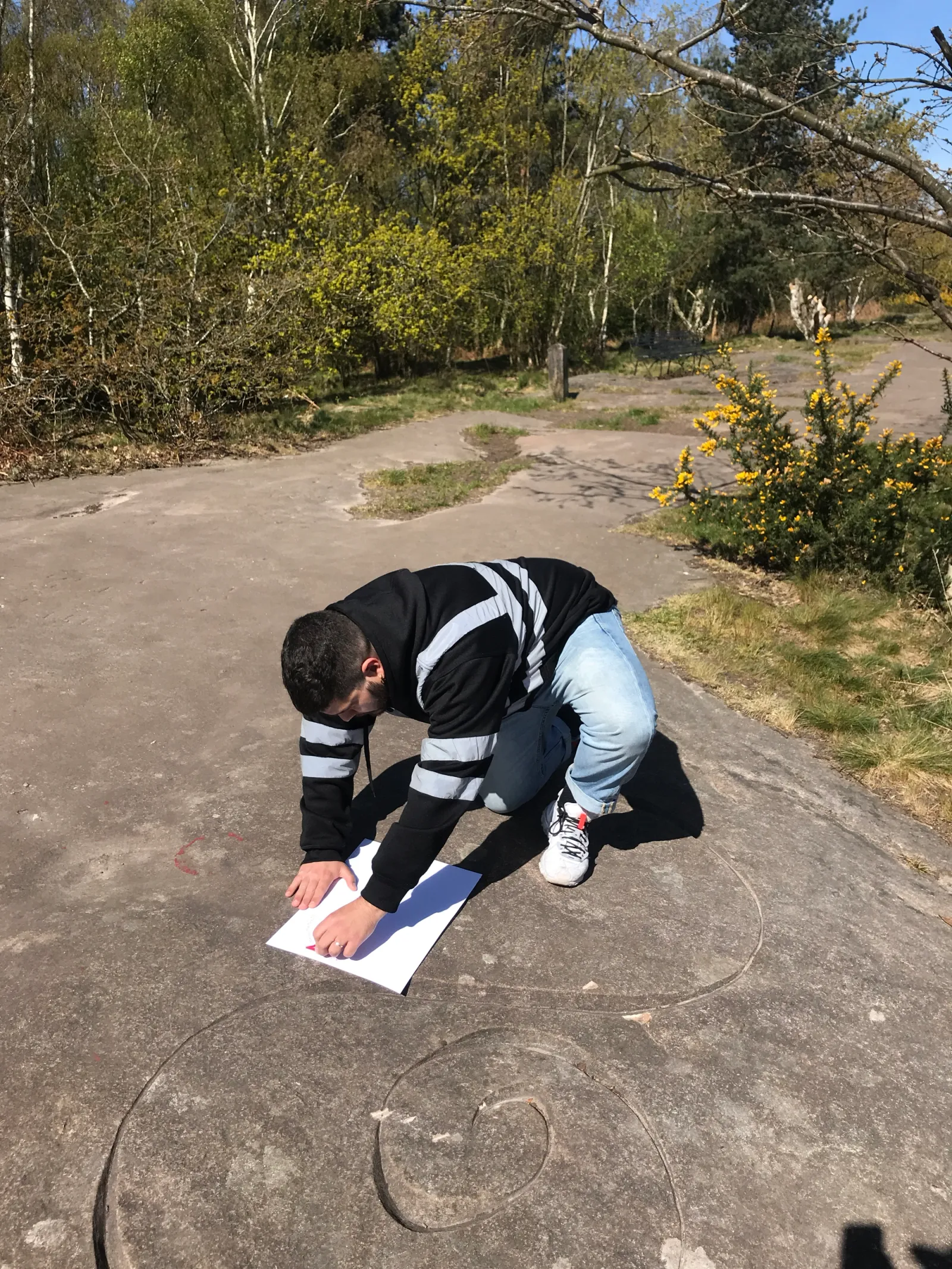
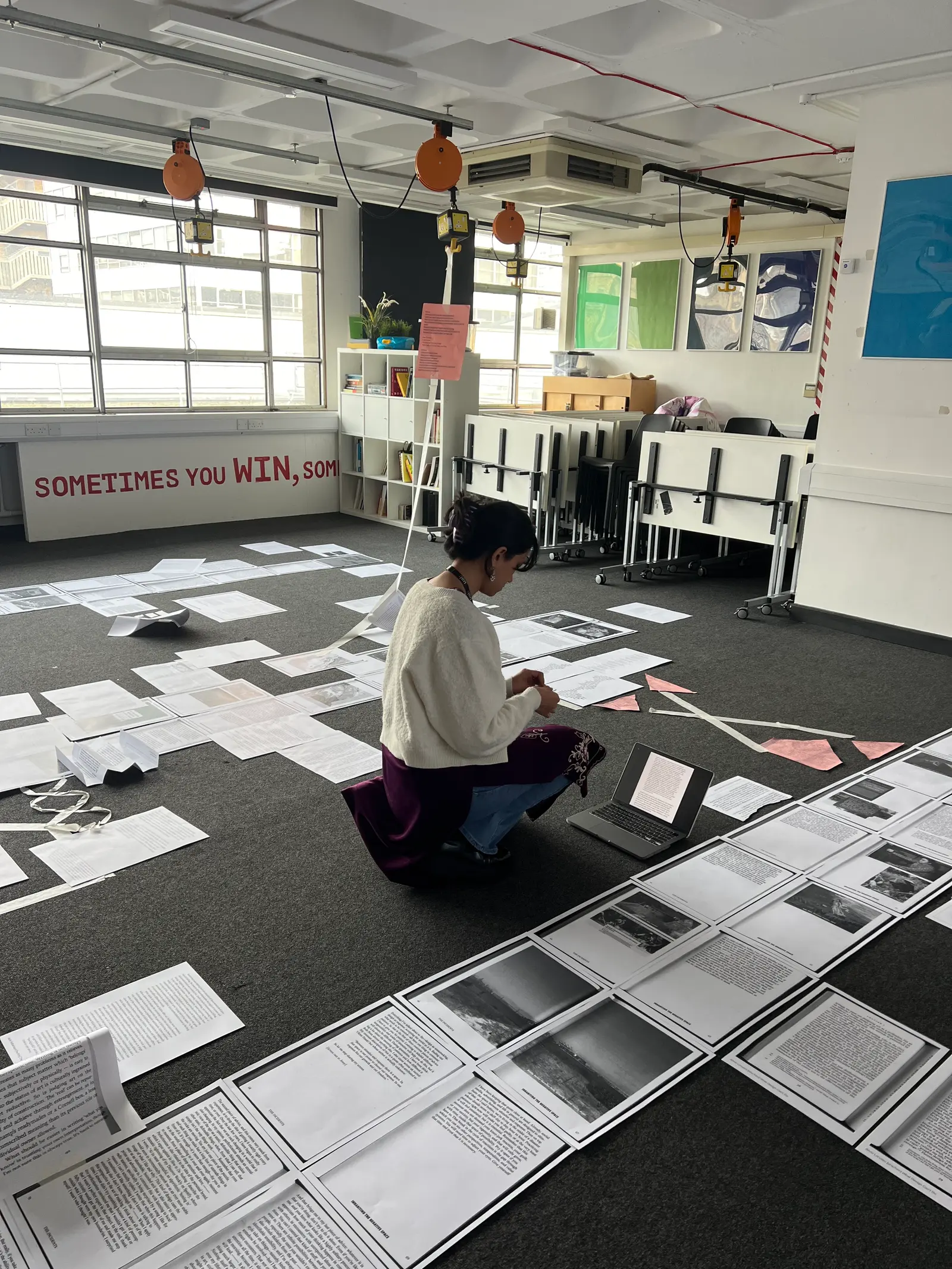
The Quadrat Workshop supported the editorial and design team in translating abstract ecological thinking into editorial strategies. Working with the idea of the “afterlife of ideas,” participants observed and analysed material traces, biological processes and human and non-human actors within assigned quadrats. Each quadrat became a site for mapping, drawing and interpreting interactions, producing relational diagrams and typographic experiments that formed the conceptual and visual foundations of the publication.
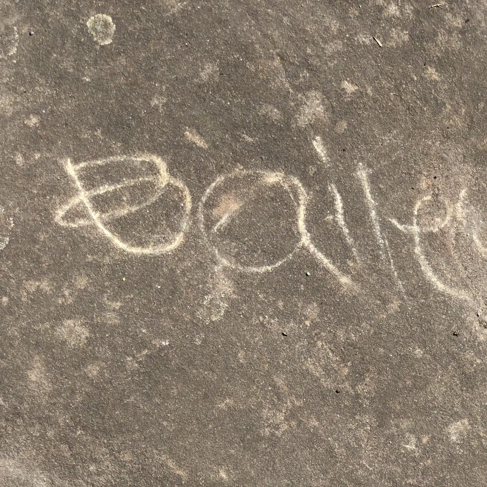
Workshop for Incidental Writing approached writing as an embodied, spatial and editorial practice. Participants used chance-based methods, such as tracing pebble outlines, to delimit fragments of source texts, producing speculative writing that introduced rupture and unpredictability. Outcomes were compiled into a collective manifesto and displayed across Bidston Hill, foregrounding writing as a distributed, material and environmental practice.
Performing Paratexts invited participants to perform the roles of title, subtitle, body text or image. Using movement and spatial arrangement, the group explored how meaning emerges through proximity, sequence and emphasis, revealing power structures embedded in publishing. Influenced by Johanna Drucker’s Diagrammatic Writing, the workshop positioned layout as performative, relational and critical rather than aiming for a final artefact.
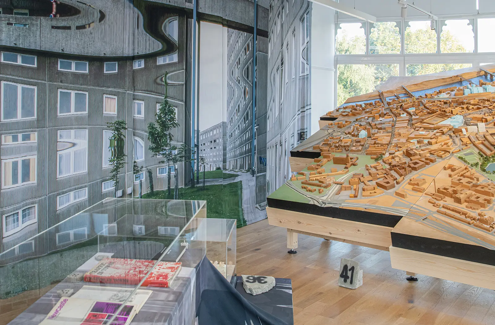
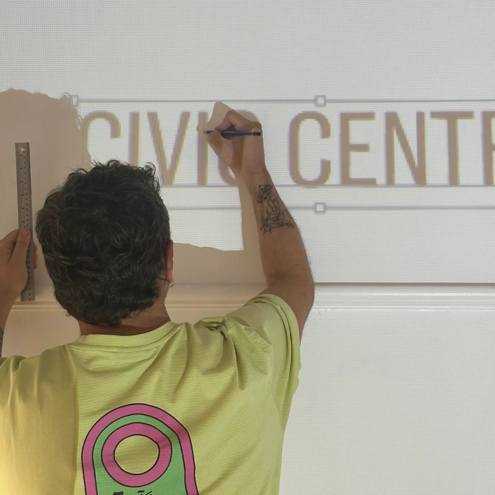
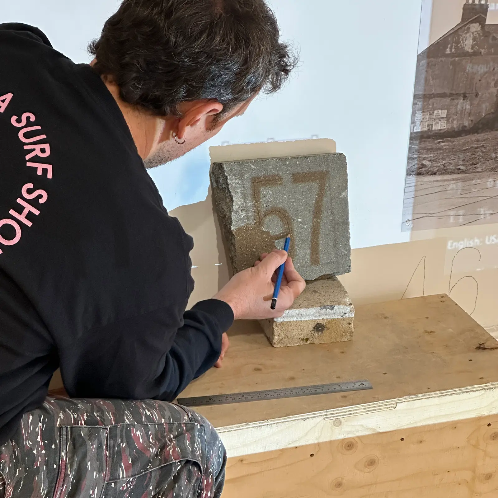
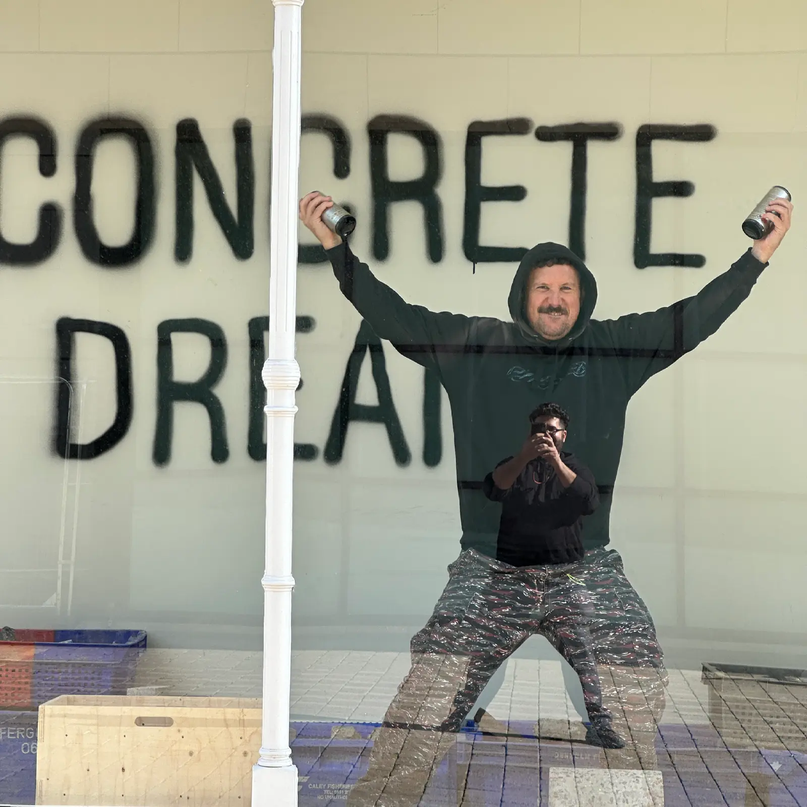
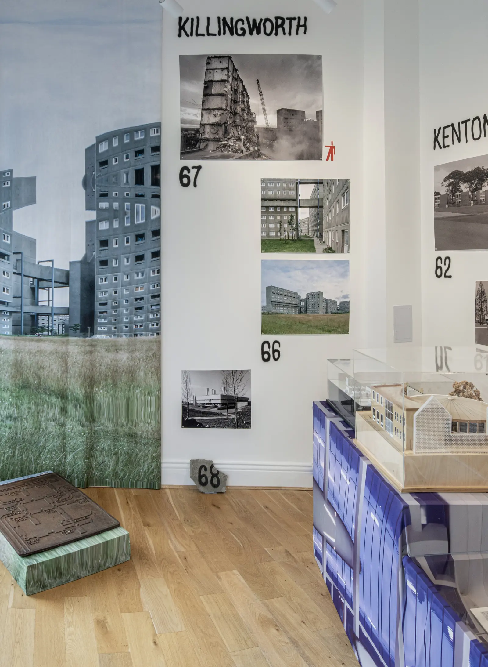
Concrete Dreams explores Tyneside’s transformation during the 1960s and 1970s, inviting visitors to craft their own narratives as they move through the exhibition. In designing the 2D and 3D elements, we reimagined the presentation of brutalist architecture for contemporary audiences, moving away from the often solemn, static approaches typically used to showcase this era of infrastructural transformation. Objects are displayed as constellations, moving away from a linear narrative, while the continuous three-room installation intentionally strips walls of traditional labels and explanations, toning down the institutional voice to create space for visitors’ own reflections and memories. Interpretation content was sprayed on locally sourced concrete rubble, echoing the theme of ruins and providing a tactile contrast to the exhibition’s title. Typographically, we took a handmade approach to emphasise the transient visual language of the built environment. Graffiti served as both a functional and symbolic medium, referencing construction site markings while evoking the rawness of vandalised architecture. Together, these decisions challenge conventional, sterile methods of presenting brutalist architecture, creating an experience that feels immediate, personal, and immersive.
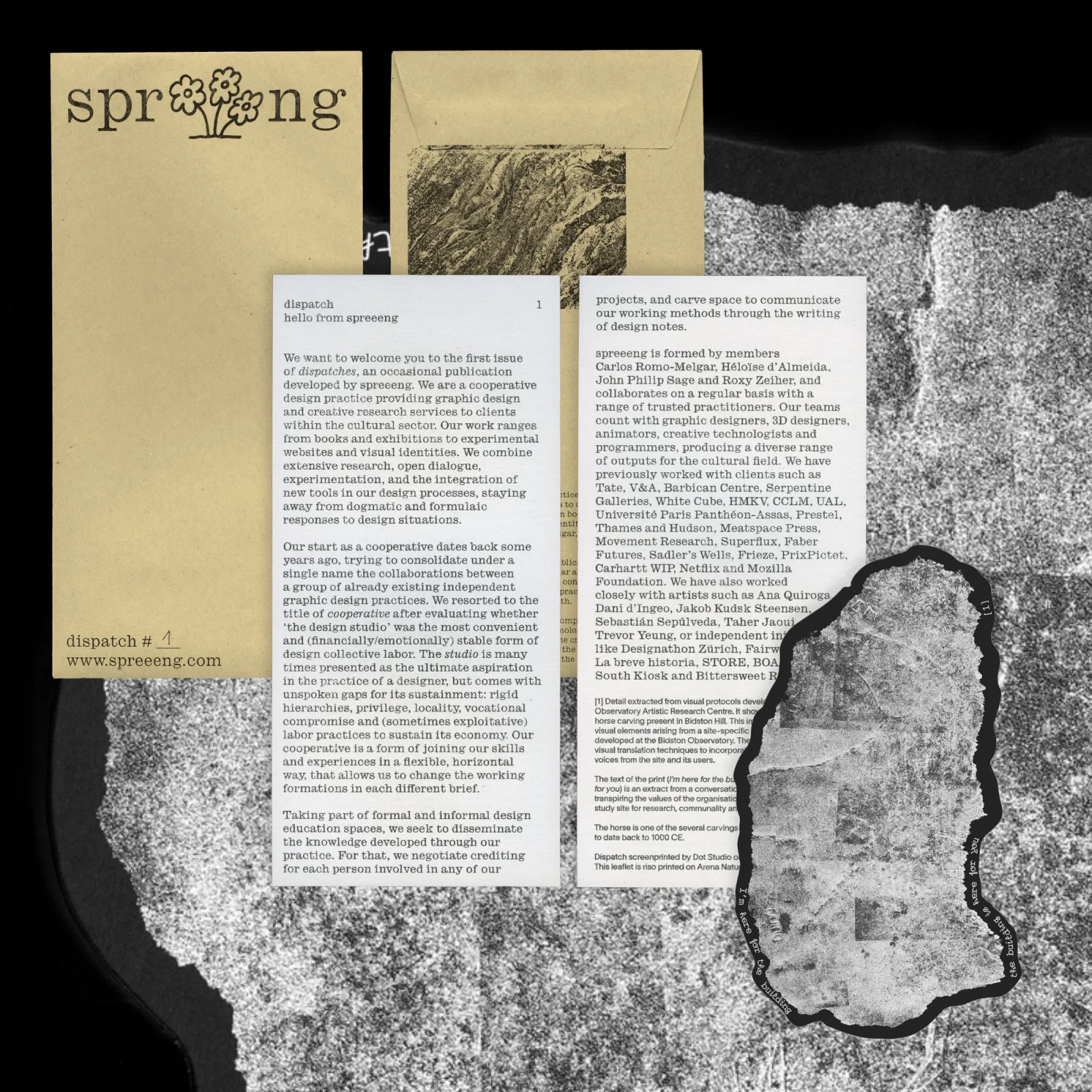
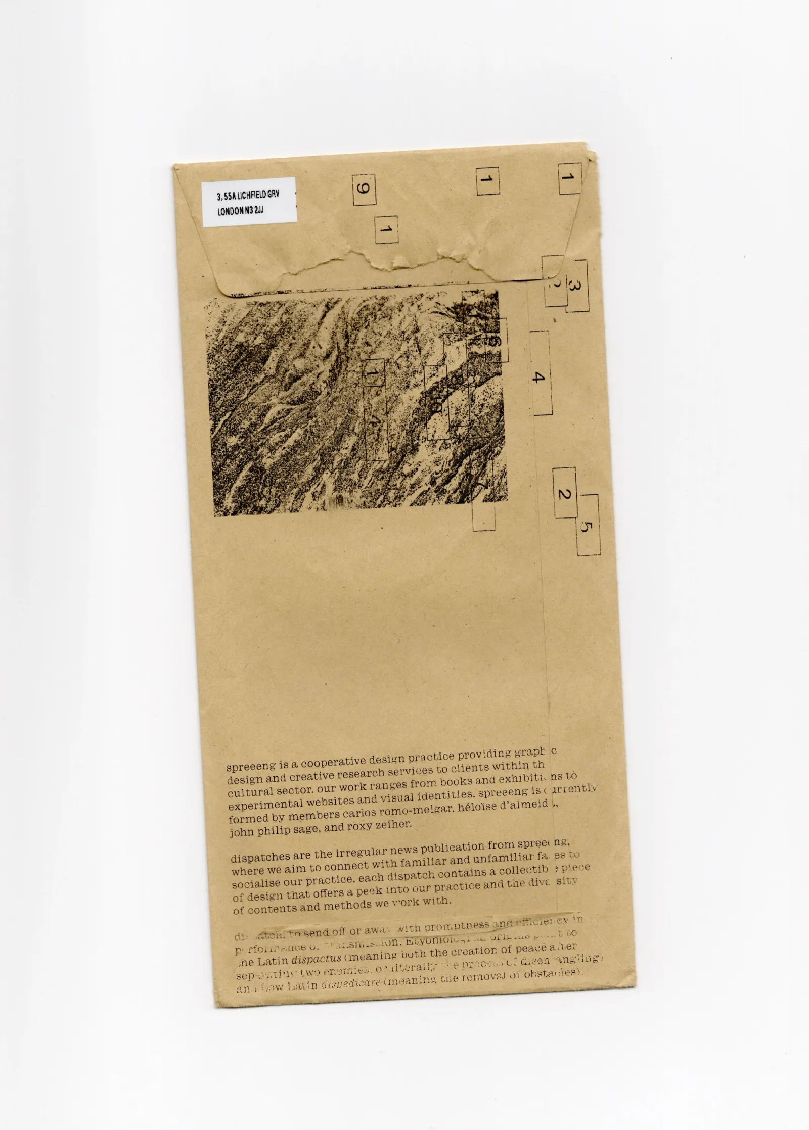
A core principal of spreeeng is the dissemination of knowledge generated through design, including occasional publications like Dispatches, which focus on snapshots of our practice, alongside an ongoing commitment to formal and informal design education. The Dispatches gather details and material traces from works developed at spreeeng.
The first issue included a welcome note introducing our cooperative, its inner politics, and current members. Featured material includes visual protocols from the Bidston Observatory Artistic Research Centre, such as a reproduction of the horse carving on Bidston Hill, derived from site-specific observational methods. The print text, I’m here for the building, the building is here for you, reflects BOARC’s ethos of research, communality, and experimentation.
For design work portfolio, please visit spreeeng, a graphic design cooperative practice co-run with carlos romo-melgar, héloïse d’almeida and roxy zeiher.

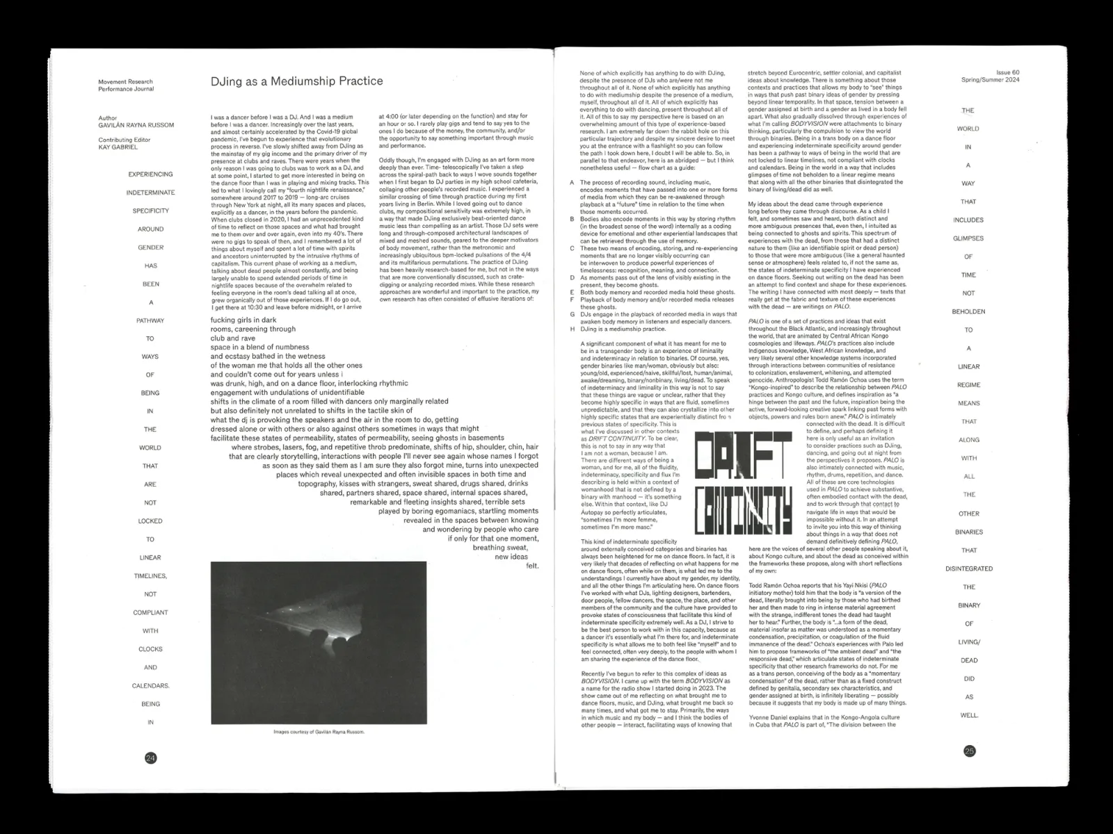
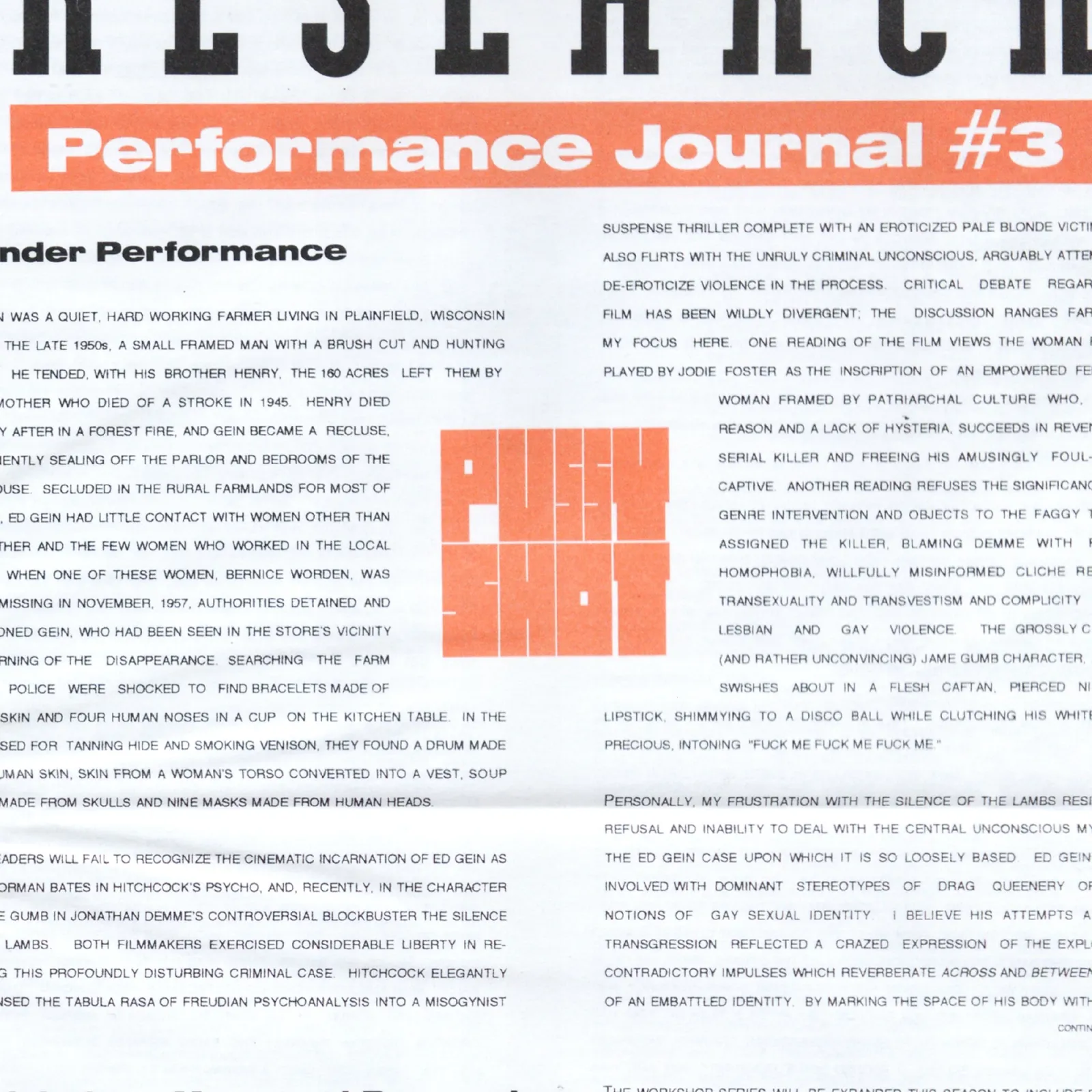
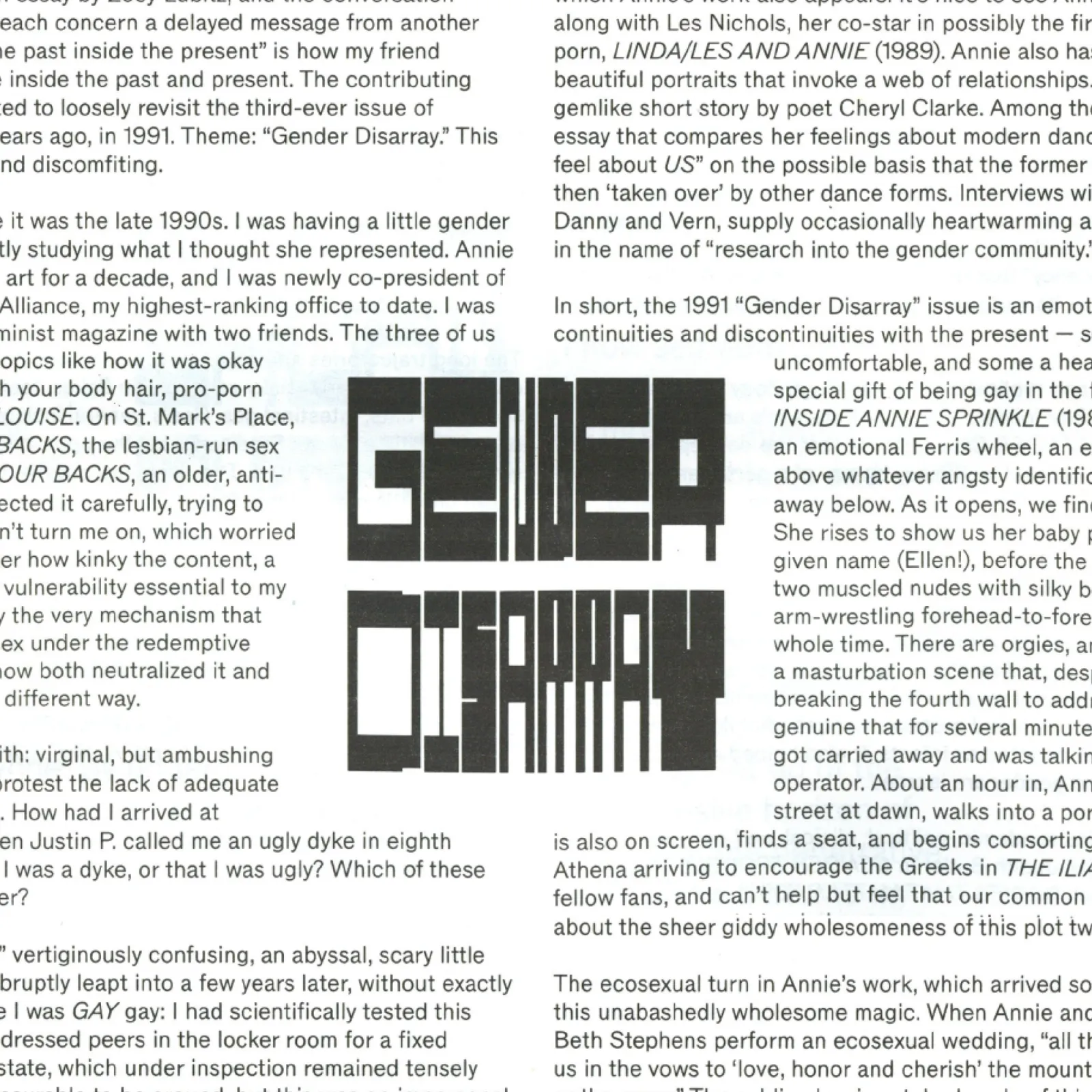
Issue #60 of the Movement Research Performance Journal revisits its controversial Issue #3, The Gender Issue (1991), which faced backlash for addressing “Gender Performance.” The design, titled Gender Disarray, adopts transtextuality as its central strategy, retrofitting formal elements from Issue #3 to collide with new content. We collected elements ranging from details like folios and signatures, to structural devices like the use of marginalia and carousel image sequences.

For Issue #60 of MRPJ, we created a custom lettering system aiming to resurface the heat-transfer works by Marlene McCarty from Issue #3, which were interwoven with the journal’s content. Similarly, in issue #60, the content wraps around the lettering which highlights selected words from each article.

Lettering and sigil design for Ana Quiroga's album Azabache, drawing on the album’s themes of ritual, ancestry, and protection.
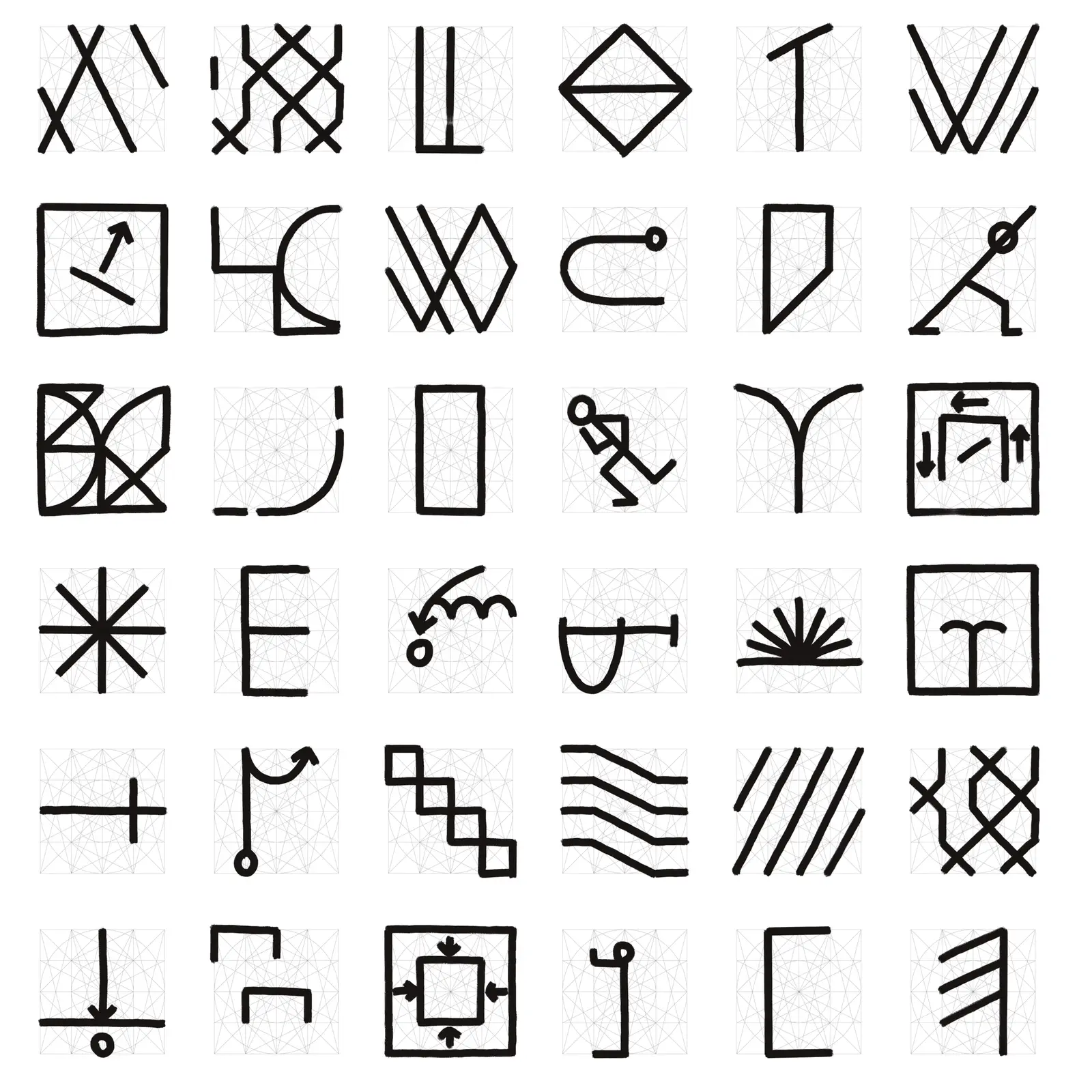
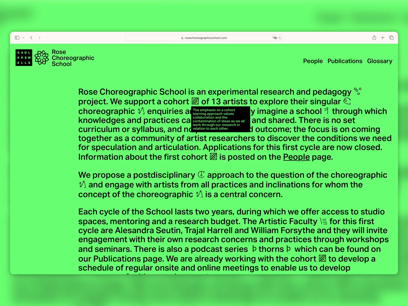
Identity and website design for Rose Choreographic School, a post-disciplinary pedagogic project at Sadlers Wells supporting artists in research around the concept of the choreographic, directed by Martin Hargreaves with faculty Alesandra Seutin, Trajal Harrell, and William Forsythe. Our approach prioritises relationships, creating a conversation space for a community of researchers, and making it visible towards online visitors. To facilitate this, we designed a system of signs that reflect the growth, contamination, and evolution of the RCS programme. the design of these sigils honors the history of graphic systems used to notate and codify dance, performance, and movement. While not direct reproductions, they act as metaphors, offering RCS participants a visual language to express and connect their concepts. Prioritizing relationships, the design creates a conversational space for the research community while remaining visible to online visitors. Presented as a glossary, the sigils populate the website, enabling non-linear, non-prescriptive navigation through the cohort’s and visitors’ evolving concerns. Designed with Carlos Romo-Melgar.
Lettering design for Dani d’Ingeo's book New Order, published by Smut Press.
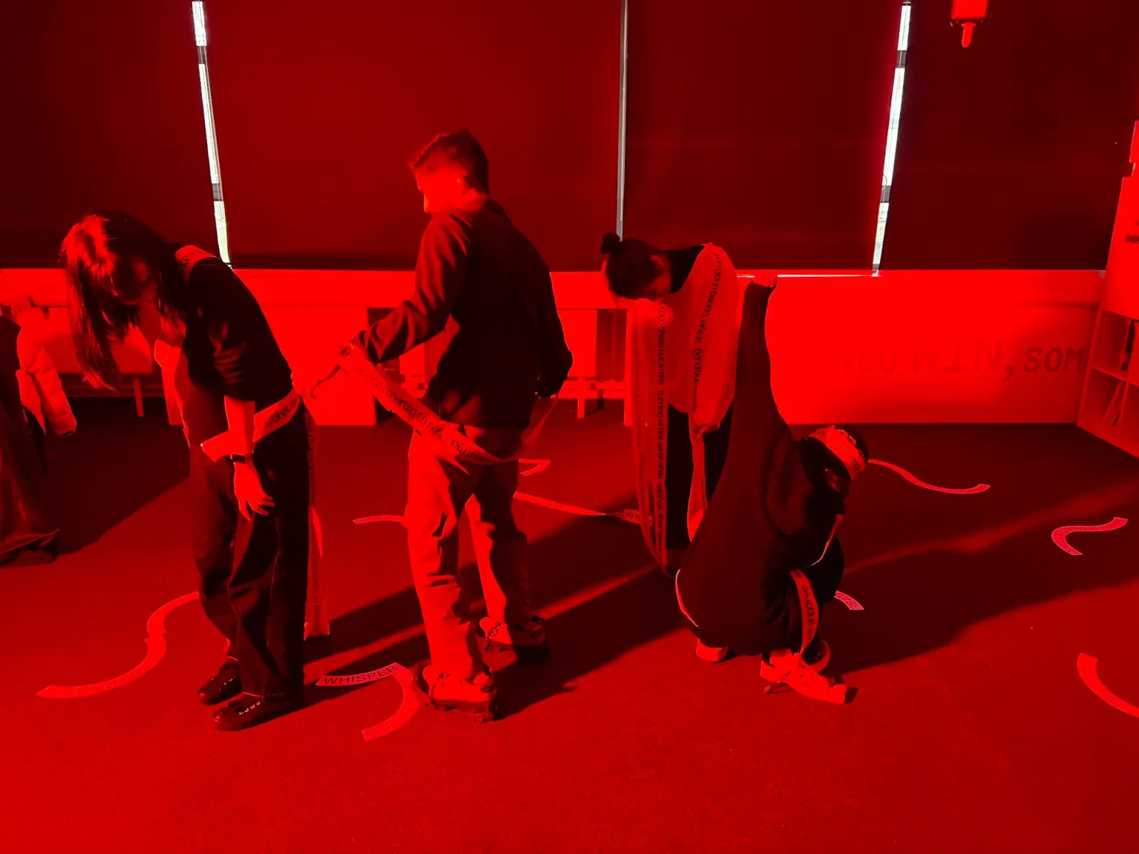
Christopher Matthews demonstrates movements inspired by the concept of a maître d’ to a group of performers for the LCC Degree Shows 2019.
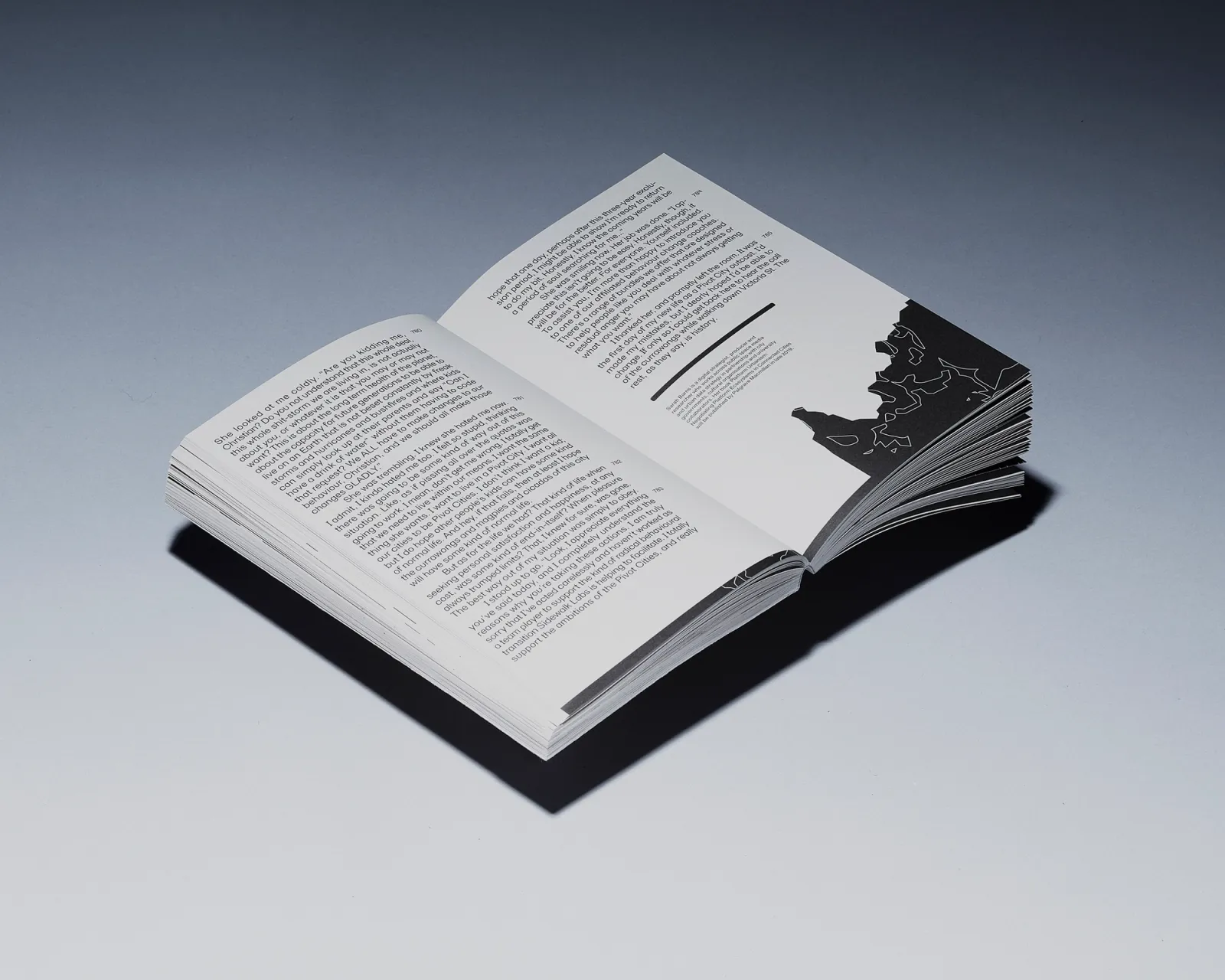
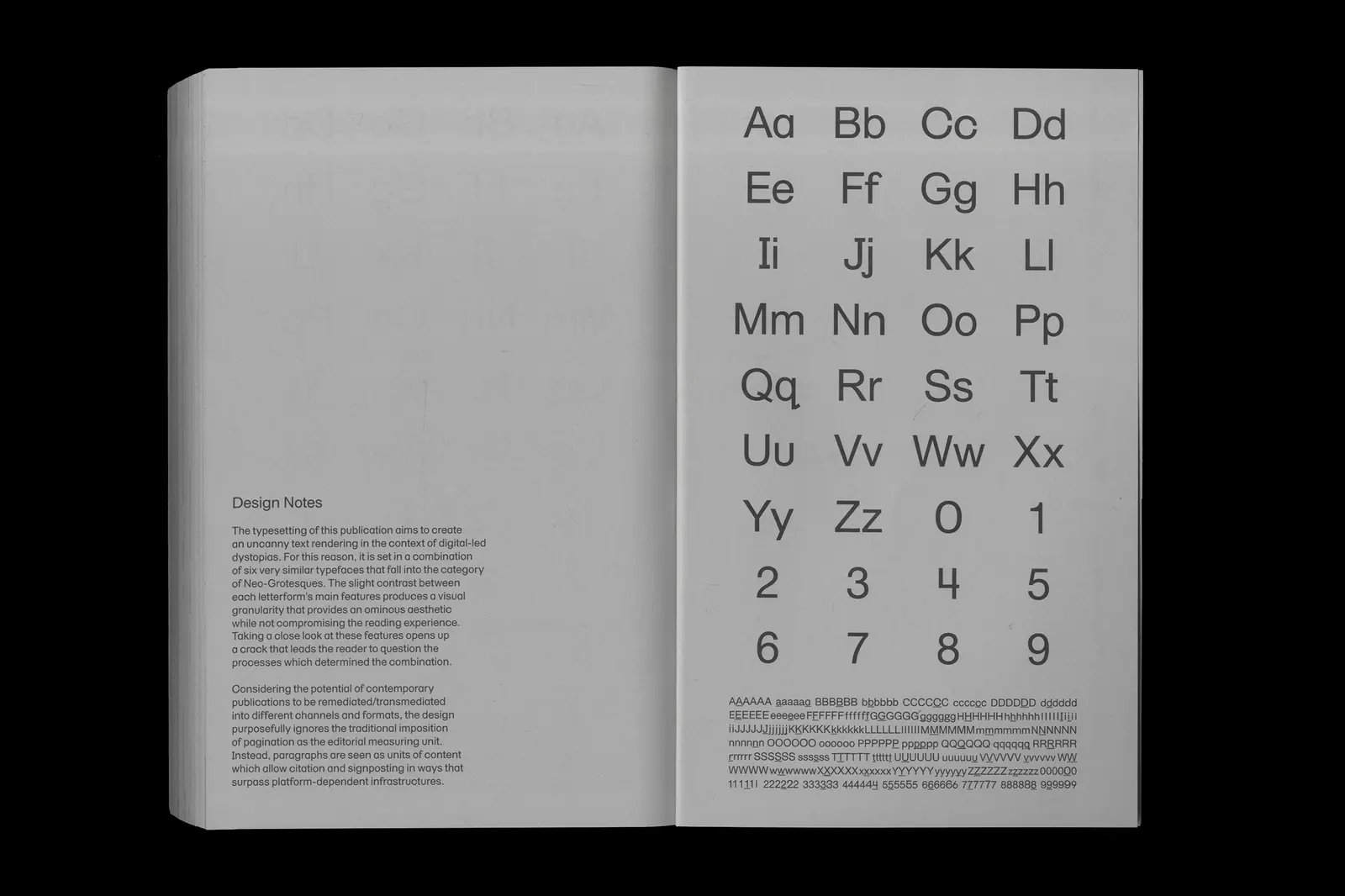
The typesetting of How to Run a City Like Amazon, and Other Fables (published by Meatspace Press) aims to create an uncanny text rendering in the context of digital-led dystopias. It is set in a combination of six very similar typefaces that fall into the category of Neo-Grotesques. The slight contrast between each letterform’s main features produces a granularity suggesting an ominous aesthetic while not compromising the reading experience. Taking a close look at these features opens up a crack that leads the reader to question the processes which determined the combination. Designed with Carlos Romo-Melgar.
This is Fake AI, a book published by Meatspace Press, explores the use of AI to conceptualise its main visual elements. Its design is a staged lie, the result of a micromanaged collaboration with a GAN (Generative Adversarial Network). Existing layout materials were reused and fed to the GAN. An overly sensitive recognition algorithm ends up producing a glitch across the whole book: all instances of “AI”, “ai”, and “Ai” are replaced by a custom AI-informed typeface, regardless of meaning or context. The dataset used to train the GAN contains logos from AI-related brands or companies in Anguilla (.ai). Designed with Carlos Romo-Melgar.
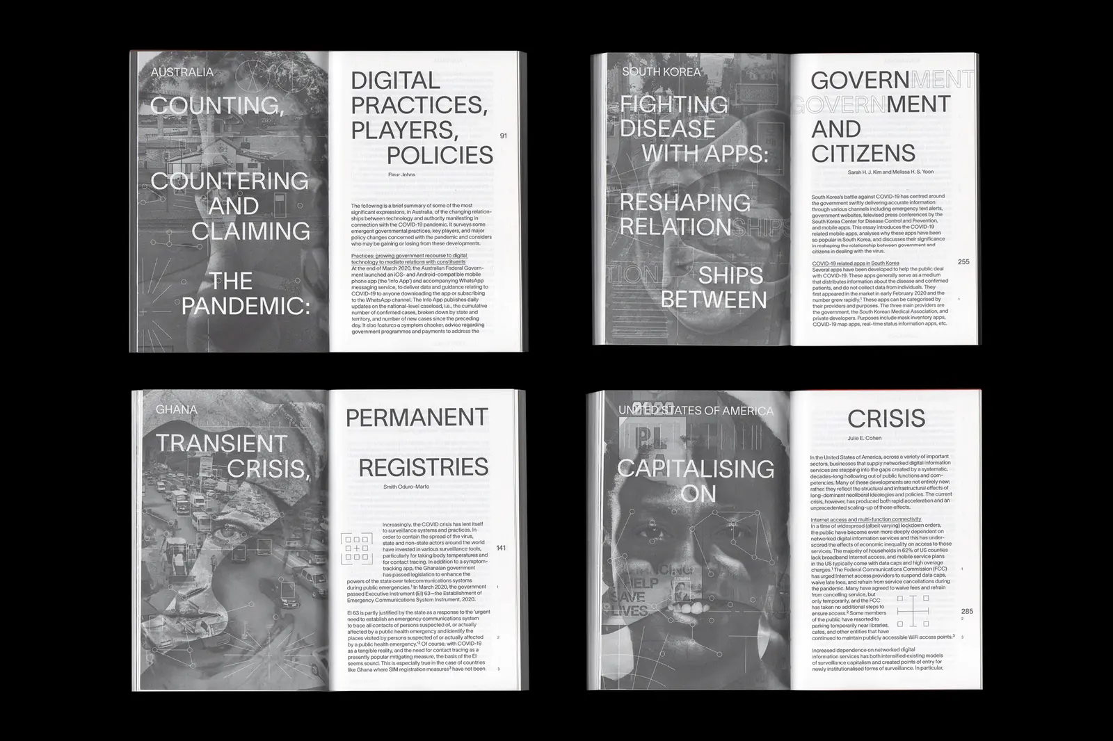
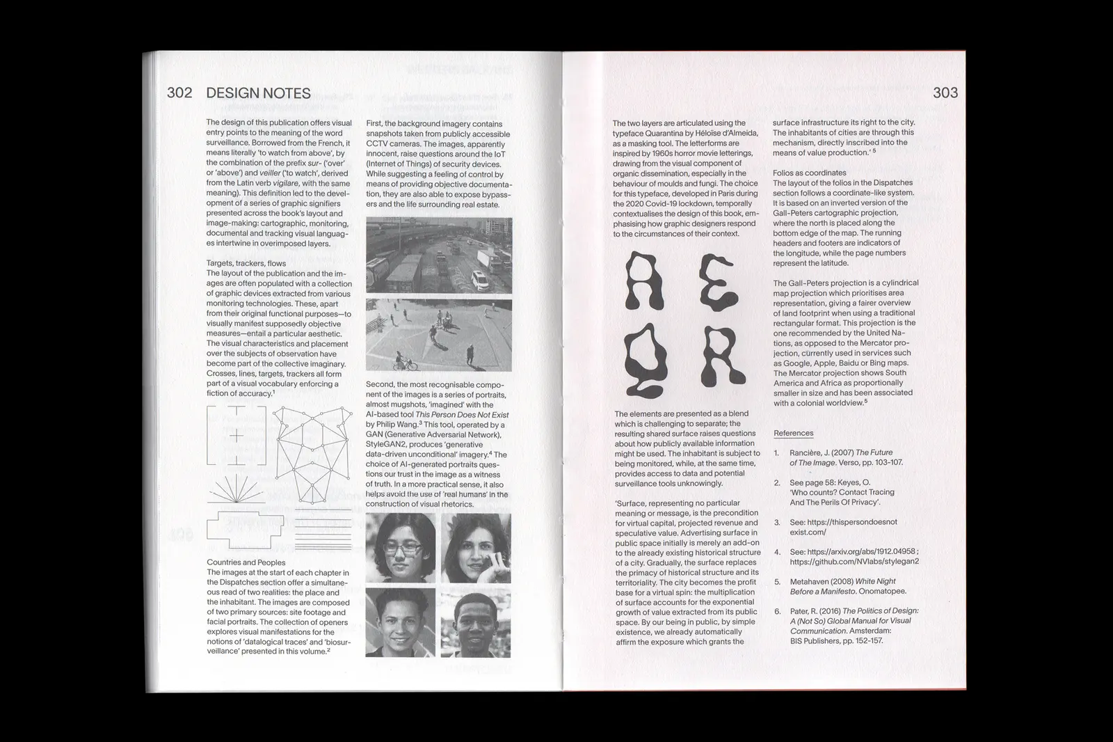
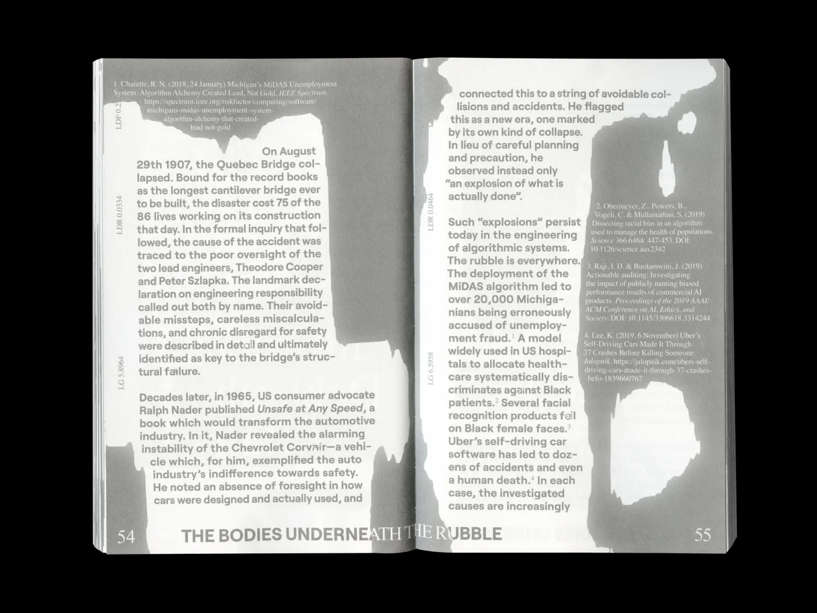
Data Justice and COVID 19: Global Perspectives, published by Meatspace Press, has a layout and images often populated with a collection of graphic devices extracted from various monitoring technologies. The layout of the folios in the Dispatches section follows a coordinate-like system based on an inverted Gall-Peters cartographic projection, with north placed along the bottom edge of the map. Running headers and footers indicate longitude, while page numbers represent latitude. Chapter openers offer a simultaneous read of two realities: the place and the inhabitant. Images are composed of site footage and facial portraits, exploring datalogical traces and biosurveillance. Designed with Carlos Romo-Melgar.
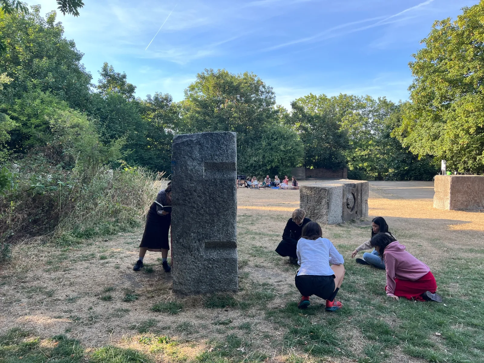
Situated Practices & Critical Positions is a workshop series that introduces students to the field of design research through a series of experimental exercises that surface individual frames of reference. It supports early-stage enquiries by helping participants identify who and what informs their thinking, including tensions, contradictions and ethical considerations. Students engage in collective mapping and image-based categorisation to challenge rational and verbal biases, encouraging embodied and ecological ways of working. Experimental models such as the tetrahedron from Metadesigners are used to articulate positions and test assumptions. Through discussion and iteration, students begin to formulate critical positions and consider potential conflicts of interest. The workshop provides a grounding in reflective design research practices, helping students clarify their direction while remaining open to complexity.
john@spreeeng.com
New York
IG @johnphilipsage
Dispatch #2 is out!

New lecture: Somatic (Acts of) Publishing, Shared (Practices of) Cooperation